


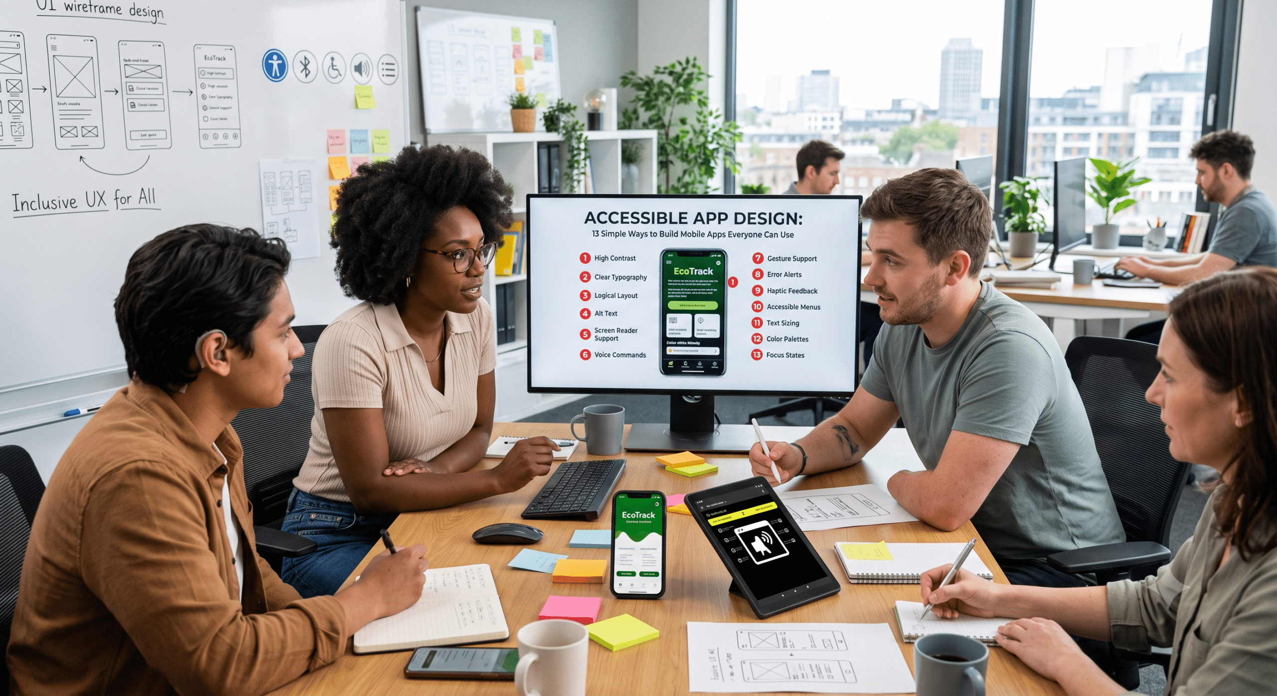
Smartphones have become a massive part of daily life, making accessible app design more critical than ever. Today, people rely on mobile apps to shop, pay bills, learn new skills, order food, manage healthcare, and stay connected. Because these applications are used by millions of people every day, they must be easy for everyone to navigate—including individuals with disabilities.
Consequently, that is where inclusive development practices become vital. Accessibility means designing and developing an app so people with different abilities can use it comfortably. Specifically, this includes people who are blind, have low vision, are deaf or hard of hearing, have limited mobility, cognitive disabilities, or temporary impairments like a broken arm.
What Is Accessible App Design?
Accessible app design is the process of creating mobile applications that everyone can use regardless of physical, sensory, or cognitive abilities. Therefore, instead of designing only for the average user, accessibility considers people who use:
Screen readers
Voice control
Switch devices
Magnification tools
Closed captions
Alternative keyboards
High-contrast settings
Large text settings
To achieve this, accessibility must be considered during every stage of app development, including:
User research
UX design
UI design
Development
Quality assurance
Product updates
Rather than adding accessibility later, successful teams build it into the project from the very beginning.
Why Accessible App Design Matters
Accessibility isn’t just about following guidelines. On the contrary, it directly improves the user experience while expanding your potential audience. Here are some important reasons why companies invest in accessibility.
More People Can Use Your App
According to the World Health Organization, over one billion people worldwide live with some form of disability. That’s a huge group of potential customers who may struggle with apps that lack accessibility. Furthermore, even users without permanent disabilities benefit from accessible features.
For example, temporary or situational limitations include:
Reading in bright sunlight
Using one hand
Recovering from surgery
Wearing gloves
Holding a baby
Temporary eye strain
Ultimately, accessibility serves real-life situations—not just permanent disabilities.
Better User Experience
Many accessibility improvements naturally create cleaner interfaces. Specifically, these enhancements include:
Larger buttons
Better spacing
Clear navigation
Simple wording
Consistent layouts
Better feedback
As a byproduct, these improvements reduce confusion for all users.
Improved Customer Satisfaction
People remember products that are easy to use. Consequently, if users can complete tasks without frustration, they’re more likely to:
Leave positive reviews
Recommend your app
Become loyal customers
Continue subscriptions
Thus, accessibility often directly increases user retention.
Stronger Brand Reputation
Companies that prioritize inclusion demonstrate social responsibility. Indeed, consumers increasingly support brands that care about every customer—not just the majority. In short, accessibility builds trust.
Easier Compliance With Regulations
Many countries now require digital accessibility. For instance, key regulations include the Americans with Disabilities Act (ADA), Section 508, and the European Accessibility Act (EAA). Therefore, designing with accessibility from the start reduces future compliance costs.
The Business Benefits of Accessible App Design
Many organizations see accessibility purely as an expense. In reality, however, it often provides measurable returns.
Larger Market Reach
Accessible apps effectively reach:
Older adults
People with disabilities
International users
Temporary impairment users
Low-literacy audiences
Naturally, more users mean more opportunities for growth.
Lower Support Costs
Apps that are easier to understand generate fewer support requests. Because clear navigation means users don’t need as much assistance, this lowers customer service expenses significantly.
Better App Store Reviews
Accessibility often improves navigation, readability, performance, and overall usability. As a result, satisfied users tend to leave better ratings.
Improved SEO for App Content
Although accessibility mainly focuses on usability, many accessibility improvements also help discoverability. For example, best practices include:
Better image descriptions
Logical content hierarchy
Clear labels
Descriptive page content
Consequently, these practices can improve search visibility for app-related web pages.
13 Essential Principles of Accessible App Design
The following principles form the foundation of accessible mobile experiences.
1. Make Text Easy to Read
Text is one of the most important parts of any mobile app. Therefore, users should never struggle to read instructions, menus, or buttons. Good readable text includes:
Simple language
Short paragraphs
Clear fonts
Comfortable spacing
Good contrast
Adjustable text size
Conversely, you should avoid tiny fonts, fancy decorative fonts, crowded layouts, and long blocks of text. Additionally, users should be able to increase font size without breaking the interface.
2. Use High Color Contrast
Color affects readability more than many designers realize. Indeed, low contrast makes text difficult to read, especially for users with low vision, color blindness, or older eyesight.
Good examples include: Black text on white backgrounds, dark blue on light gray, and white text on dark blue.
Poor examples include: Yellow on white, light gray on white, and red on green.
Ultimately, high contrast benefits everyone—not just users with disabilities.
3. Never Use Color Alone
Many apps rely only on colors to communicate information. For example, they might use red to mean an error and green to mean success. However, this creates major problems for color-blind users.
Instead, combine color with icons, labels, patterns, or text messages. For instance, use:
✔ Payment Successful
instead of showing only a green circle. Likewise, use:
❌ Payment Failed
instead of only a red warning. In conclusion, users should be able to understand information even without seeing colors.
4. Create Large Touch Targets
Tiny buttons frustrate users because small touch areas make mistakes more likely. To fix this, buttons should be easy to tap, well-spaced, clearly labeled, and large enough for different finger sizes. Ultimately, large touch targets improve usability for older adults, users with tremors, one-handed users, and people using assistive devices.
5. Keep Navigation Simple
Complex navigation causes users to get lost. Therefore, good navigation should always feel predictable. Best practices include:
Consistent menus
Familiar icons
Clear page titles
Easy back navigation
Logical screen order
Above all, avoid changing navigation patterns throughout the app. Since users learn interfaces through repetition, consistency builds confidence.
6. Support Screen Readers
Many people who are blind rely on screen readers like Android TalkBack and Apple VoiceOver. Because these tools read content aloud, developers should add meaningful labels, name buttons clearly, describe images, use proper headings, announce alerts, and maintain a logical reading order.
For example, instead of naming a button “Button”, use “Add to Cart” or “Complete Purchase”. In this way, specific labels greatly improve navigation, ensuring screen reader support makes an app feel natural rather than frustrating.
7. Add Captions and Transcripts for Media
Videos and audio can make an app more engaging, but they also need to be accessible. After all, users who are deaf or hard of hearing may not be able to understand spoken content without captions. Likewise, some users simply prefer reading text instead of listening to audio.
Therefore, every app that includes multimedia should offer:
Closed captions for videos
Transcripts for podcasts or voice recordings
Subtitles for spoken dialogue
Visual indicators for important sounds
For instance, a fitness app that includes workout videos should provide captions for every instruction. Similarly, a language-learning app should allow users to read the dialogue while listening to pronunciation. Furthermore, captions help people who watch videos in noisy places, keep their phones on silent, or speak English as a second language.
8. Don’t Depend Only on Gestures
Modern mobile apps often use gestures such as swipes, pinches, shakes, long presses, and multi-finger taps. While these gestures can be convenient, not every user can perform them. For example, someone with limited hand movement or motor disabilities may find swipe-only controls difficult or impossible.
Instead, provide alternative ways to complete the same task, such as:
Adding visible buttons alongside swipe actions.
Including menu options for hidden features.
Letting users zoom using controls instead of pinch gestures.
Offering keyboard support where appropriate.
By doing so, giving users multiple ways to interact makes your app far more flexible.
9. Write Helpful Error Messages
Every user makes mistakes. However, the difference between a frustrating app and a great one is how it responds when something goes wrong. Instead of showing a message like “Error 103,” try something like, “Your password must contain at least eight characters.”
To be effective, helpful error messages should explain what happened, tell users how to fix it, highlight the affected field, and use simple language without technical terms.
Whenever possible, try to prevent mistakes before they happen by:
Showing password requirements while typing.
Validating email addresses instantly.
Formatting phone numbers automatically.
Warning users before deleting important data.
Ultimately, reducing confusion creates a smoother user experience.
10. Design for Different Screen Sizes
People use apps on many different devices, including small smartphones, large smartphones, foldable phones, tablets, and devices in landscape mode. Consequently, an interface that looks great on one screen may become difficult to use on another.
Fortunately, responsive layouts help maintain accessibility by ensuring that:
Buttons remain easy to tap.
Text stays readable.
Images resize properly.
Menus remain visible.
Content doesn’t overlap.
Therefore, testing on several devices is one of the easiest ways to identify layout problems before users do.
11. Let Users Customize Their Experience
Not every user has the same preferences or needs. Thus, providing customization options makes your app more inclusive. Useful accessibility settings include:
Adjustable font sizes
Dark mode
High-contrast themes
Reduced motion
Adjustable playback speed
Volume controls
Color customization
Notification preferences
In fact, allowing users to personalize their experience often leads to greater comfort and longer engagement. For instance, someone with low vision may increase text size, while another user may enable dark mode to reduce eye strain at night. In short, accessibility is about giving people choices.
12. Give Clear Feedback After Every Action
Users should always know what happened after they interact with your app. Otherwise, imagine pressing a button and seeing no response—did it work, or should you tap again?
To eliminate this, good feedback removes uncertainty through:
Loading indicators
Success messages
Error notifications
Progress bars
Confirmation dialogs
Haptic feedback
Audible announcements for screen readers
For instance, after submitting a form, display: “Your appointment has been scheduled successfully,” rather than simply returning users to the previous screen. As a result, clear feedback builds confidence and reduces repeated actions.
13. Test Accessibility Throughout Development
Accessibility should never be the final item on a project checklist. Instead, it should be tested during every stage of development. Because regular testing helps identify issues before they become expensive to fix, a complete accessibility review should include screen reader testing, keyboard navigation, color contrast checks, font scaling, touch target verification, orientation testing, voice control testing, and real-device testing.
Even better, include people with disabilities in usability testing. Since real users often discover issues that automated tools cannot detect, continuous testing leads to better products and happier users.
Common Accessibility Mistakes to Avoid
Even experienced design teams sometimes overlook accessibility. Therefore, being aware of these common mistakes can help you avoid unnecessary usability issues.
Small Text Sizes: Tiny fonts may look modern, but they can be difficult to read for many users. Instead, always support scalable text.
Low Contrast Colors: Light gray text on a white background may appear attractive, but it often fails accessibility standards. Always choose color combinations with sufficient contrast.
Missing Labels: Buttons, icons, and images should include meaningful labels for assistive technologies, since icons alone are not always clear.
Complex Navigation: Avoid hiding essential features behind multiple menus or confusing gestures. Instead, users should be able to reach important tasks quickly.
Auto-Playing Media: Videos or audio that start automatically can interrupt screen readers. Therefore, always let users decide when to play media.
Poor Form Design: Long forms with unclear labels create unnecessary frustration. To fix this, group related fields together and provide clear instructions.
Ignoring Accessibility During Updates: Adding new features without accessibility testing can introduce new problems. Consequently, you should review accessibility after every major release.
Accessibility Is a Team Effort
Building an accessible mobile app isn’t the responsibility of just one person. Rather, it requires collaboration across the entire product team, where each role contributes in different ways:
Designers create layouts that are easy to read, understand, and navigate.
Developers implement accessibility features such as semantic labels, screen reader support, scalable text, and proper touch targets.
QA testers verify that accessibility features work correctly on different devices and with assistive technologies.
Content writers use clear language, descriptive headings, and meaningful button labels.
Product managers make accessibility part of the project’s core goals instead of treating it as an optional feature.
Ultimately, when every team member considers accessibility from the beginning, the final product becomes more inclusive and easier for everyone to use.
Accessibility Trends Shaping Mobile Apps
Technology continues to evolve, and accessibility is improving alongside it. Specifically, some trends that are influencing modern accessible app design include:
AI-powered image descriptions for users with vision loss
Voice-first navigation and voice assistants
Real-time captions for live conversations
Personalized accessibility settings based on user preferences
Improved haptic feedback for navigation
Better support for foldable devices and larger screens
Smarter screen readers that understand app context
Clearly, these innovations are making mobile experiences more inclusive than ever before. As new technologies emerge, accessibility will remain an essential part of delivering high-quality apps.
Frequently Asked Questions (FAQ)
What is accessible app design?
Accessible app design is the process of creating mobile applications that everyone can use, including people with visual, hearing, motor, or cognitive disabilities. Specifically, it focuses on making apps easier to navigate, understand, and interact with through features like screen reader support, readable text, captions, and accessible controls.
Why is accessible app design important?
First and foremost, accessible app design helps more people use your app successfully. Additionally, it improves the overall user experience, increases customer satisfaction, expands your audience, and helps organizations comply with accessibility laws. Many accessibility improvements, such as larger buttons and better contrast, also make apps easier for all users.
What accessibility features should every mobile app include?
Most modern mobile apps should include screen reader compatibility, high color contrast, adjustable text sizes, large touch targets, captions for videos, descriptive labels, simple navigation, clear error messages, and alternatives to gesture-only controls. Together, these features make apps more inclusive across different situations and devices.
How do Android and iPhone support accessibility?
Android offers accessibility tools such as TalkBack, Voice Access, Switch Access, Live Caption, and Magnification. Meanwhile, Apple provides VoiceOver, AssistiveTouch, Voice Control, Live Captions, and Display & Text Size settings. Therefore, developers should ensure their apps work smoothly with these native operating system features.
Does accessible app design improve SEO?
Indirectly, yes. While accessibility itself is not a direct search ranking factor for mobile apps, many accessibility best practices improve content quality. For instance, clear headings, descriptive labels, and logical navigation also benefit app landing pages and website SEO.
Is accessible app design only for people with disabilities?
No, absolutely not. Everyone benefits from accessible design. For example, larger text helps people reading outdoors, captions help users in noisy environments, voice control assists people who are driving, and simple navigation helps first-time users. In short, accessibility improves the experience for a wide range of users.
What are the biggest accessibility mistakes developers make?
Some of the most common issues include poor color contrast, tiny text, missing labels for screen readers, small tap targets, complex navigation, and gesture-only interactions. Fortunately, addressing these issues early saves time and creates a better product.
Conclusion
Creating an accessible mobile app is about more than meeting technical standards—it’s about making sure every person can use your product with confidence and ease. Whether someone relies on a screen reader, needs larger text, prefers captions, or simply appreciates a cleaner interface, accessibility ultimately improves the experience for everyone.
By following the 13 principles covered in this guide, you can build apps that are more inclusive, user-friendly, and future-ready. From readable text and high color contrast to responsive layouts and ongoing testing, each improvement contributes to a better product that serves a wider audience.
In conclusion, the best time to think about accessible app design is at the very beginning of a project. When accessibility is built into planning, design, development, and testing, it becomes a natural part of the user experience instead of an afterthought. As mobile technology continues to evolve, accessibility will remain a key part of quality app development, ensuring organizations that invest in inclusive design today are better positioned to earn user trust and create products that truly work for everyone.
References
The following trusted resources provide in-depth guidance on mobile accessibility, inclusive design, and accessibility standards:
World Wide Web Consortium (W3C) – Web Accessibility Initiative (WAI). Mobile Accessibility Guidance. https://www.w3.org/WAI/
W3C Web Content Accessibility Guidelines (WCAG) 2.2. https://www.w3.org/TR/WCAG22/
Android Developers. Accessibility Overview. https://developer.android.com/guide/topics/ui/accessibility
Android Developers. Accessibility Scanner. https://support.google.com/accessibility/android/answer/6376570
Apple Developer. Accessibility. https://developer.apple.com/accessibility/
Apple Human Interface Guidelines – Accessibility. https://developer.apple.com/design/human-interface-guidelines/accessibility
MDN Web Docs. Mobile Accessibility Checklist. https://developer.mozilla.org/en-US/docs/Web/Accessibility/Guides/Mobile_accessibility_checklist
Deque University. Mobile Accessibility Best Practices. https://dequeuniversity.com/
Nielsen Norman Group. Accessibility and Inclusive Design Articles. https://www.nngroup.com/topic/accessibility/
Microsoft Inclusive Design Toolkit. https://inclusive.microsoft.design/
The A11Y Project. Accessibility Resources. https://www.a11yproject.com/