


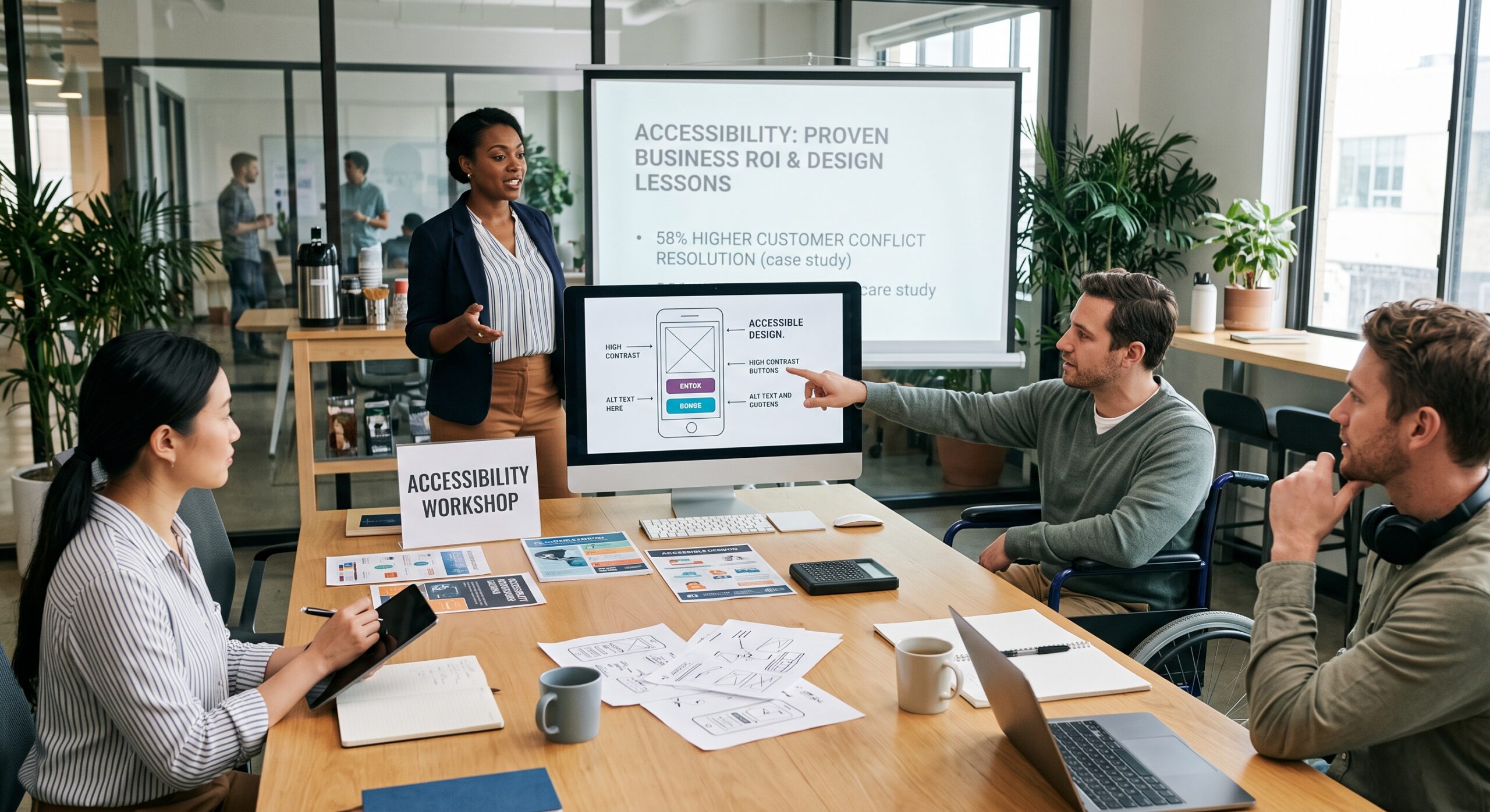
Teams achieve maximum impact by prioritizing accessibility from the start. Therefore, creators should not treat it as a final task. Indeed, compelling real-world evidence shows clear benefits. Inclusive design improves far more than access for disabled people. For example, it also enhances usability, search visibility, and site performance. Furthermore, it boosts customer confidence, employee productivity, and overall business resilience.
This article examines real-world case studies across digital products. Additionally, it covers websites, public spaces, and user experience programs. Furthermore, it explains what organizations can learn from these examples. As a result, you will learn to translate core principles into practical design decisions.
The Strategic Value of Real-World Design Examples
Technical guidelines often feel abstract as pure compliance requirements. Terms like keyboard navigation, alt text, and captions matter deeply. Meanwhile, focus order, color contrast, and semantic structure also play vital roles. Fortunately, reviewing documented industry examples makes these concepts far more meaningful. Consequently, it connects guidelines directly to real people and measurable outcomes.
A customer facing keyboard barriers experiences real frustration. Likewise, a blind visitor missing form field labels faces severe roadblocks. Similarly, heavy public doors block individuals with limited mobility. Ultimately, these physical and digital barriers prevent full participation.
In fact, these industry examples highlight three crucial principles:
- Business Impact: Inclusion barriers directly harm core business goals. Specifically, they hurt sales, retention, support, and overall reputation.
- Universal Benefit: Inclusive improvements frequently benefit non-disabled users as well.
- Organizational Integration: Sustainable accessibility requires systemic, organizational changes. Thus, it spans research, design, development, content, procurement, and leadership.
The W3C outlines several major business benefits of digital inclusion. First, it expands market reach and improves user experience. Second, it lowers legal risk, strengthens brand reputation, and boosts productivity. Consequently, teams must look beyond simple audit passes. Instead, they should measure whether people can complete tasks with dignity and independence.
Digital Product and Retail Case Studies
1. Legal & General: Driving Traffic and ROI
Legal & General offers a classic web accessibility case study. The company overhauled its website to meet core standards. Moreover, they actively improved usability while boosting overall site quality. For instance, they focused heavily on performance, maintenance, mobile compatibility, and search visibility.
As a result, the overhaul yielded substantial, immediate results. Natural search traffic jumped 25 percent in 24 hours. Subsequently, it grew by 50 percent. Meanwhile, quote requests doubled within three months. Additionally, maintenance costs fell by 66 percent. Furthermore, page-loading times improved by 75 percent. Finally, the project achieved a 100 percent ROI within 12 months.
These outcomes prove a critical point. Specifically, teams cannot isolate inclusive practices from general digital quality. Indeed, assistive technology interprets well-structured websites much faster. Similarly, search engines index them more easily. Furthermore, content teams maintain them with less effort. Most importantly, customers navigate them far more quickly.
Key Digital Redesign Changes
Redesigns involve unique technical details, but the core lesson remains clear. The team integrated universal access into overall site quality. Consequently, they avoided treating it as a separate feature.
Likely areas of improvement included:
- Clearer page structure and hierarchy.
- More consistent navigation patterns.
- Better support for mobile users.
- Improved content organization.
- More efficient publishing and maintenance processes.
- Reduced reliance on inaccessible visual or technical components.
Practical ROI Takeaway
Organizations must avoid measuring usability through defect counts alone. Instead, connect inclusive design work directly to core business metrics. For example, track task completion rates, form abandonment, mobile performance, and search growth. Overall, the Legal & General example shows a key lesson. Projects gain rapid momentum when senior leaders see clear financial returns.
2. Tesco: Generating Revenue Through Accessible E-Commerce
The W3C also highlights retail examples like Tesco. The major retailer invested heavily in an accessible website. Tesco spent approximately £35,000 to build the site. Consequently, the accessible redesign generated an estimated £13 million annually
However, analysts must interpret this scale carefully. Obviously, not every design project yields the exact same return. Market size, product quality, demand, and execution drive ultimate results. Nevertheless, the lesson is clear. Inaccessible commerce excludes customers right when they intend to buy.
Friction Points in the Online Journey
Online retail experiences often fail due to accumulated minor barriers:
- Product images lack useful descriptions.
- Filters require a mouse to operate.
- Interface designs rely solely on color indicators.
- Error messages remain vague or disappear quickly.
- Checkout forms lack clear labels.
- Unnecessary time limits disrupt the checkout process.
- Promotional pop-ups trap keyboard users.
- Payment controls confuse users relying on assistive technology.
A single issue causes frustration. Furthermore, several issues combined make transactions impossible.
Comprehensive Journey Testing
Therefore, usability testing must follow the complete customer journey. Never audit isolated pages alone. Instead, teams should thoroughly test core tasks. For instance, test product search, option comparisons, basket additions, and discount codes. Similarly, evaluate address entry and secure payment flows. Do not just ask, “Is this button accessible?” Rather, ask: “Can a customer independently complete the purchase?”
3. CNET: Boosting Search Engine Traffic with Transcripts
Media growth examples also show impressive results. Specifically, CNET reported a 30 percent traffic increase from Google. This followed their launch of transcripts and HTML video content. Therefore, the W3C includes this example in its business case collection.
Transcripts primarily support people who are deaf or hard of hearing. However, they also help users in quiet environments or those who prefer reading. Additionally, transcripts generate rich, indexable text for search engines.
This clearly demonstrates the “curb-cut effect.” In short, a feature built for one group quickly benefits everyone. For example, captions help viewers in noisy environments. Similarly, transcripts help researchers locate specific quotes quickly. Meanwhile, text versions also support users on limited mobile bandwidth.
Audio and Video Publishing Guidelines
Publishers should always provide accurate captions and complete transcripts. Furthermore, include speaker identification and keyboard-friendly media controls. Teams can use automated captions as a starting point. However, human editors must review them to correct technical terms and names.
In addition, writers should draft content specifically for comprehension. Use plain language, descriptive headings, and short paragraphs. Consequently, meaningful link labels improve experiences for cognitive disabilities and general users alike.
4. Microsoft: Scaling Innovation with Inclusive Design
Microsoft uses inclusive design to build products for all human abilities. Their real-world examples showcase practical features. These include Live Captions, customizable avatars, and adaptive software.
This approach consciously begins with human diversity. Thus, it avoids designing for a single assumed “typical” user. After all, people experience temporary, situational, or permanent limitations. Therefore, a deaf user, someone with an ear infection, and a commuter in a loud space all benefit from captions.
Shifting the Product Design Framework
Conventional design asks, “What is the typical user trying to do?” Conversely, inclusive design asks broader, critical questions:
- Who might this interaction exclude?
- What assumptions are we making about vision, movement, or attention?
- How can the experience adapt to different user needs?
- What happens on slow connections or small screens?
- Have people with disabilities participated in research and testing?
As a result, this framework transforms design long before development starts. Ultimately, it catches exclusion early, when fixes are cheap and non-disruptive.
Collaborative Research with Disabled Users
Inclusive design workshops must include people with diverse access needs. Obviously, participants cannot speak for every disabled person. However, their lived experiences reveal barriers that automated tools miss completely.
For example, teams might discover screen readers struggle with card layouts. Likewise, drag-and-drop elements often fail keyboard users. Similarly, unnecessary animations can cause physical discomfort. Ultimately, these findings lead to far better design alternatives.
Physical Environment Accessibility Examples
Digital design is only one part of an inclusive environment. Meanwhile, physical environments also require careful planning. For instance, a building might feature an entrance ramp yet remain hard to use. Specifically, narrow doors, poor signage, and bad lighting cause major issues. Furthermore, inaccessible restrooms and a lack of seating create severe barriers.
Therefore, planners must evaluate physical accessibility as a complete journey. A person faces barriers travelling to locations and finding entrances. Next, they encounter issues opening doors, moving between floors, and reading signs. Finally, audio announcements, restroom access, and emergency exits also present challenges.
Elements of Inclusive Physical Design
Inclusive physical design incorporates step-free routes and automatic doors. Furthermore, it uses clear, high-contrast signage alongside tactile and Braille indicators. Facilities should also offer hearing loops, accessible counters, and quiet sensory areas. Overall, the best solutions combine physical and digital support. For instance, museums can pair step-free access with clear online trip guides.
Core Findings from Real-World Evidence
Across these diverse industry examples, several patterns emerge:
Key Success Patterns
- Inclusion improves the whole experience: Clear structure, captions, and flexible interactions benefit broad audiences. This includes older adults, mobile users, and non-native speakers.
- Accessible design significantly reduces operational costs: Reusable, well-designed components lower long-term maintenance. Moreover, consistent form patterns reduce software bugs. Similarly, structured content repurposes easily across apps and support channels.
- Teams must involve disabled users directly: Automated scanners spot missing labels or contrast issues. However, they cannot evaluate task logic or comprehension. Therefore, teams must conduct direct user research.
- Usability requires ongoing governance: A single redesign is never enough. After all, new content, updates, and marketing campaigns reintroduce barriers quickly. Thus, mature programs require policies, clear ownership, ongoing training, and regular reviews.
How to Build a Sustainable Roadmap
Replicate the success of these real-world examples with a simple roadmap:
- Identify high-impact journeys: Focus on essential tasks first. For example, prioritize appointment bookings, product purchases, and support form submissions.
- Audit the current experience: Combine automated checks, expert reviews, and keyboard testing. Furthermore, include screen-reader checks and tests with disabled users.
- Prioritize by consequence: Fix critical journey blockers before addressing minor aesthetic issues.
- Design accessible patterns: Create reusable patterns for headings, forms, dialogs, navigation, and notifications.
- Build inclusion into delivery: Add accessibility criteria directly into design reviews, user stories, and acceptance testing.
- Measure outcomes: Track task completion, complaint volumes, support shifts, and overall site performance.
Frequently Asked Questions About Inclusive Design
What are Accessibility Case Studies?
They document real-world accessibility projects. Specifically, they show how organizations identified and fixed barriers across websites, apps, products, and physical spaces.
Why are these real-world examples useful?
Because they connect abstract design rules to clear business results. Moreover, case studies highlight human impacts, justify investments, and showcase proven solutions.
Is accessibility only for people with disabilities?
No, not at all. Inclusive features help everyone. For example, captions aid users in noisy rooms. Likewise, keyboard access helps users with hand injuries. Similarly, clear text assists people under stress.
Can automated tools solve the problem?
Automated tools quickly flag missing labels or bad contrast. However, they cannot evaluate usability or logical flow. Therefore, manual reviews and user testing remain mandatory.
How many accessibility standards should a business follow?
First, identify the specific legal standards for your region and sector. For digital products, the Web Content Accessibility Guidelines (WCAG) offer the best foundation.
How should success be measured?
Measure both technical compliance and actual user experience. Specifically, track completion rates, error counts, support volume, and user satisfaction.
What is the first step for a small organization?
Pick one critical customer journey. Next, test it using keyboard navigation, mobile devices, and screen readers. Finally, use those findings to build a practical, prioritized fix list.
References
- The Business Case for Digital Accessibility Core focus: Details how digital accessibility expands market reach, drives product innovation, enhances brand reputation, and minimizes legal risk.
- WAI-Engage Case Studies Repository Core focus: Open repository documenting financial and operational business cases, including accessibility performance data from Tesco and CNET.
- Inclusive Design Real-World Examples Core focus: Practical product applications—such as Live Captions, customizable avatars, and adaptive features—tailored to diverse human needs.
The core lesson from these documented examples is simple. Inclusive design is not an extra task to tackle later. Instead, it is a primary strategy for building better products for everyone. Ultimately, designing for accessibility from the start reduces exclusion, lifts quality, and builds confidence for all users.