

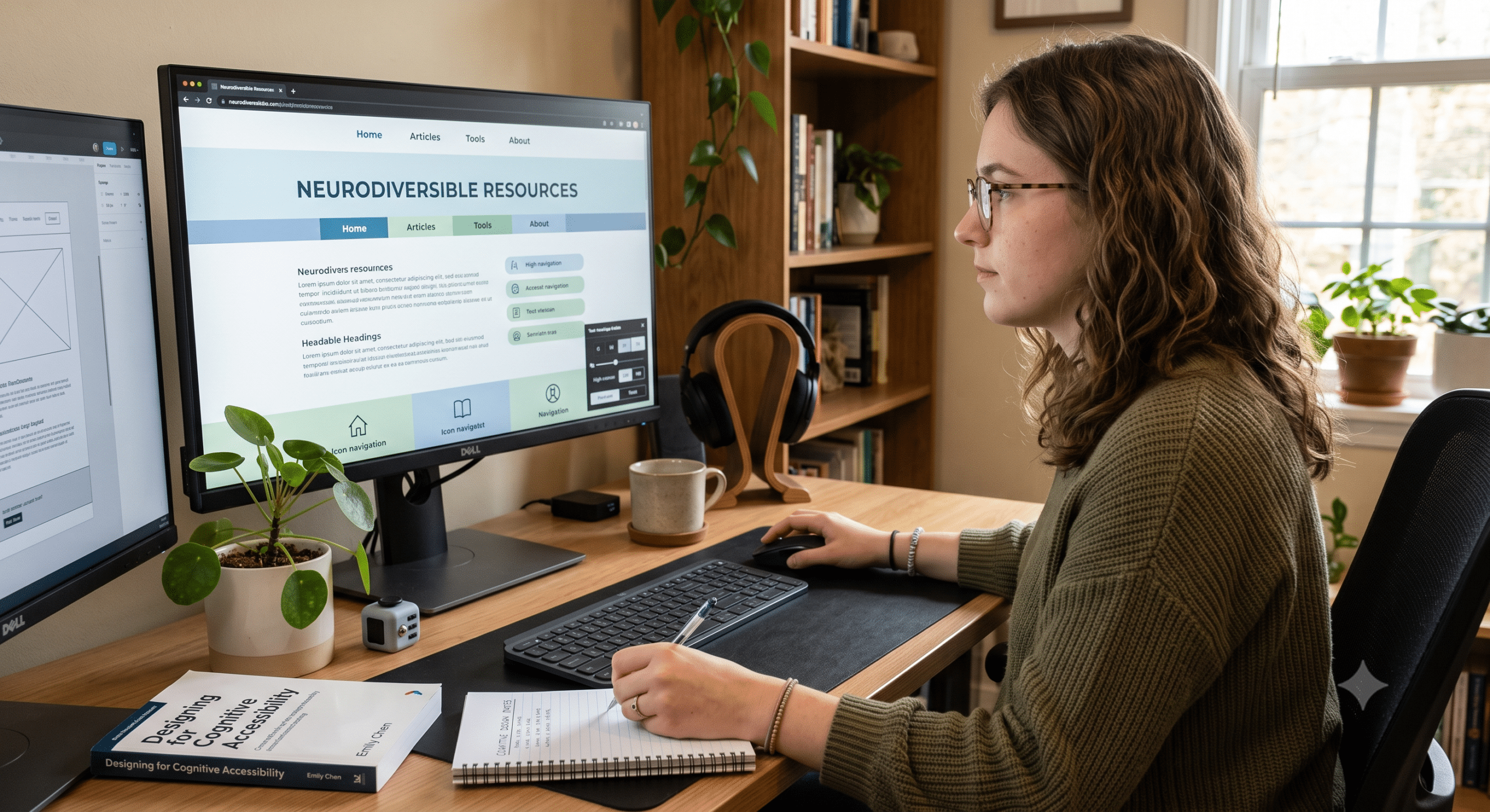
For many years, digital accessibility has focused primarily on helping people with physical disabilities—but today, neurodivergent web design is expanding that focus to support how users process information mentally. Specifically, early web accessibility taught designers how to support screen readers, keyboard navigation, color contrast, and captions for videos. While these improvements made the web significantly more inclusive, they ultimately solved only part of the accessibility challenge.
Today, more organizations recognize that true accessibility must also include how people think, process information, remember instructions, and stay focused. Consequently, this is where neurodivergent web design becomes essential for creating clear, accessible digital experiences.
As a Neuroinclusive UX Researcher, I have often seen usability studies where users did not struggle because they lacked technical skills. Instead, they struggled because the interface demanded too much mental effort. For instance, pages were crowded with information, navigation changed unexpectedly, forms required remembering several steps, and pop-ups repeatedly interrupted concentration. Ultimately, these issues affected many users—not just people with diagnosed cognitive conditions.
Neurodivergent users typically include people with ADHD, autism, dyslexia, dyscalculia, dyspraxia, Tourette syndrome, acquired brain injuries, and other cognitive differences. Although every person experiences the web differently, many share a common need: digital experiences that reduce unnecessary thinking and increase clarity.
Above all, good design should never make users feel overwhelmed.
That is precisely why neurodivergent web design is becoming one of the most important topics in modern UX. Instead of asking users to adapt to complicated interfaces, designers now build products that actively adapt to human thinking.
As a result, this approach benefits everyone:
For instance, simple navigation helps busy parents quickly find what they need.
Similarly, clear writing helps people reading in a second language.
Furthermore, consistent layouts help older adults feel secure.
Ultimately, predictable interfaces reduce frustration for all users.
This idea directly reflects one of usability’s oldest principles: when you design for the edges, everyone in the middle benefits as well.
What Is Neurodivergent Web Design?
Neurodivergent web design is the practice of creating websites that work well for people whose brains process information differently.
Rather than treating neurodivergence as a problem to fix, neuroinclusive design recognizes neurological differences as a natural part of human diversity.
Consequently, a neuroinclusive website helps users to:
Understand information quickly
Stay focused on their goals
Avoid unnecessary sensory overload
Complete tasks without confusion
Recover easily from mistakes
Feel confident while navigating
Notice that none of these goals require expensive technology. Instead, most improvements come directly from thoughtful UX decisions.
For example, effective strategies include:
Shorter paragraphs
Consistent navigation
Descriptive headings
Simple forms
Fewer visual distractions
Predictable page layouts
In short, these changes reduce overall cognitive load, thereby making websites noticeably easier for everyone to use.
Understanding Cognitive Accessibility
Cognitive accessibility refers to designing digital products that support different ways of thinking, learning, remembering, and processing information. Unlike physical accessibility, cognitive accessibility focuses primarily on mental effort.
Since every website asks users to think, questions like these constantly appear:
Where should I click next?
What does this button actually do?
Which step comes next in the process?
Why did this page suddenly change?
Did my payment go through correctly?
How do I go back to the previous screen?
If every action requires extra thinking, users naturally become tired. This mental effort is technically called cognitive load.
When cognitive load becomes too high, users often react by:
Abandoning their purchases midway
Leaving complex forms unfinished
Forgetting important instructions
Making avoidable mistakes
Feeling anxious or overwhelmed
Stopping their use of the product altogether
Therefore, reducing cognitive load stands as one of the primary goals of neurodivergent web design.
Why More Organizations Are Paying Attention
Fortunately, the conversation around accessibility has expanded dramatically over the past several years. Organizations now understand that accessibility is not merely about legal compliance; rather, it actively improves key business outcomes, such as:
Customer satisfaction
Employee productivity
Conversion rates
Digital trust
Brand reputation
Indeed, research consistently shows that easier experiences lead directly to higher completion rates. When users spend less energy figuring out an interface, they can focus entirely on their actual goal.
For businesses, this translates to:
Fewer abandoned shopping carts
Fewer customer support tickets
Faster user onboarding
Higher overall engagement
Happier, more loyal customers
In summary, accessibility and business performance inevitably improve together.
The Different Ways Neurodivergent Users Experience Websites
Naturally, there is no single “neurodivergent user” because every person experiences technology differently. Still, UX research has identified common design challenges across several key groups:
Users with ADHD
People with ADHD may experience ongoing challenges with sustained attention and working memory. Consequently, common frustrations include:
Distracting visual animations
Autoplay videos
Cluttered, busy pages
Excessively long forms
Inconsistent site layouts
Multiple competing calls to action
Therefore, simple interfaces are vital because they help these users stay focused on one task at a time.
Users with Dyslexia
Reading can become particularly difficult when text is poorly organized. For example, challenges often stem from:
Dense blocks of paragraphs
Overly decorative fonts
Low color contrast
Justified text alignments
Overly long line lengths
Fortunately, good typography dramatically improves readability. In addition, many dyslexic users appreciate:
Larger text spacing
Shorter, clearer sentences
Meaningful, prominent headings
Clear supporting icons
Well-structured bullet lists
Users on the Autism Spectrum
Autistic users often place high value on consistency and predictability. Consequently, unexpected changes can severely interrupt concentration. Common issues include:
Sudden pop-ups
Unexpected moving elements
Changing navigation menus
Inconsistent action labels
Flashing advertisements
Thus, stable interfaces effectively reduce stress and improve user confidence.
Users with Memory Challenges
In addition, some users have difficulty remembering previous steps, which directly affects critical workflows like:
Checkout flows
Registration processes
Application forms
Healthcare portals
Banking websites
To address this, helpful interfaces reduce memory demands by showing relevant information precisely when users need it, rather than expecting them to remember everything from earlier screens.
Common Problems Found During UX Research
During usability testing, the same problems tend to appear repeatedly. Importantly, these issues rarely come from the users themselves; instead, they stem directly from flawed design decisions.
Some of the biggest usability barriers include:
1. Too Much Information
Many websites attempt to answer every possible question at once. However, the result is often severe information overload where users simply don’t know where to begin. Thus, instead of helping, excessive content actively increases decision fatigue.
2. Unclear Navigation
Furthermore, menus with vague labels force users to guess their meaning. Common examples include:
Solutions
Explore
Discover
Resources
More
While these labels often make sense to internal marketing teams, they frequently confuse first-time visitors. In contrast, clear labels such as:
Pricing
Support
Contact
Products
Documentation
reduce uncertainty immediately.
3. Complex Forms
Long forms represent one of the single biggest sources of user abandonment. Specifically, widespread problems include:
Unclear error messages
Hidden entry requirements
Passwords with complicated rules
Fields that completely reset after minor mistakes
Ultimately, a neuroinclusive form guides users gently instead of punishing them for minor errors.
4. Too Many Visual Distractions
Modern websites frequently contain too many competing elements, such as:
Continuous animations
Floating chat windows
Sticky promotional banners
Autoplay videos
Pop-up promotions
High-pressure countdown timers
Because each interruption competes for attention, these distractions can make completing even simple tasks exhausting for many neurodivergent users.
7 Principles of Neurodivergent Web Design
To address these barriers, the following principles consistently appear in successful neuroinclusive products:
1. Keep Navigation Predictable
First and foremost, people should always know where they are. Menus should remain consistent across all pages, and buttons should behave the same way everywhere. As a result, users won’t need to relearn the interface on every screen. Ultimately, predictability reduces anxiety and builds confidence.
2. Reduce Cognitive Load
Whenever possible, ask only one question at a time. In addition, break complicated processes down into smaller steps and remove unnecessary choices, because every extra decision increases mental effort. Consequently, even small simplifications often produce major usability improvements.
3. Write in Plain Language
Avoid technical jargon wherever possible.
Instead of saying: “Authentication failed due to credential mismatch.”
Say clearly: “Your email or password is incorrect.”
By using plain language, you help everyone understand crucial information much faster.
4. Make Content Easy to Scan
Since most people don’t read every word on a screen, they scan instead. Therefore, support this behavior by using:
Descriptive headings
Concise bullet lists
Generous white space
Short paragraphs
Highlighted keywords
Together, these formatting techniques effectively reduce reading fatigue and improve overall comprehension.
5. Provide Helpful Feedback
Users should always know what is happening behind the scenes. For example, provide clear real-time updates like:
“Saving your changes…”
“Payment completed.”
“Step 2 of 4 finished.”
“Your file uploaded successfully.”
Indeed, immediate feedback reduces uncertainty and helps users feel in full control of their actions.
6. Give Users Control Over Their Experience
One of the main goals of neurodivergent web design is allowing users to adjust the experience to meet their individual needs. Because people process information in vastly different ways, a one-size-fits-all interface rarely works well.
However, giving users options does not mean cluttering the interface with dozens of settings. Instead, offer simple, practical controls such as:
Pausing or stopping animations
Turning off autoplay videos
Increasing text size
Switching to high-contrast mode
Choosing light or dark themes
Saving progress in long forms automatically
Extending session times before auto-logging out
Ultimately, these small features make a massive difference for users who require extra time or fewer distractions.
7. Design for Mistakes, Not Perfection
Everyone makes mistakes online. Therefore, the difference between a frustrating website and a helpful one lies in how it responds when something goes wrong.
Instead of showing confusing system messages like “Error Code 502”, explain the problem clearly. For example, state: “We couldn’t process your payment. Please check your card details and try again.”
Even better, preserve the user’s entered information so they do not have to start over from scratch. Overall, helpful error handling should:
Explain what happened in simple terms.
Highlight the exact field that needs attention.
Suggest precisely how to fix it.
Keep completed information intact.
Avoid blaming the user.
When people can recover quickly from mistakes, they are far more likely to finish their task and return to your site in the future.
Real-World Examples of Neuroinclusive UX
Interestingly, many successful digital products already apply principles that support neurodivergent web design—even if they do not explicitly market them as such.
Example 1: Progressive Forms
Instead of presenting twenty fields on a single, intimidating page, many modern websites divide forms into smaller, sequential steps. Consequently, this provides:
Less visual clutter
Better task focus
Reduced memory load
Clearer progress tracking
Additionally, displaying a visual progress indicator such as “Step 2 of 5” helps users understand exactly how much work remains.
Example 2: Clear Dashboard Layouts
A dashboard should help users find information quickly rather than forcing them to search through dozens of widgets. Therefore, a neuroinclusive dashboard typically includes:
Clear section headings
Consistent icon placement
Logical grouping of information
Generous use of white space
Limited, prioritized notifications
In short, the main goal is to guide attention rather than compete for it.
Example 3: Streamlined Checkout Experiences
Online shopping carts often fail simply because checkout pages become unnecessarily complicated. Conversely, good checkout experiences:
Ask strictly for essential information
Explain shipping costs early in the process
Offer a guest checkout option
Show clear progress indicators
Display explicit confirmation messages
By reducing uncertainty, these design decisions build trust while simultaneously lowering cart abandonment.
Common Design Mistakes That Increase Cognitive Load
Even highly experienced design teams can unintentionally create usability barriers. During UX studies, the following issues tend to appear time and again:
Too Many Choices: Offering dozens of options at once may seem helpful, but it actually slows down decision-making. Instead of displaying twenty navigation links on a homepage, highlight the most important actions first, because less choice frequently leads to better outcomes.
Inconsistent Layouts: When menus, buttons, or page structures change unexpectedly, users must spend extra mental energy relearning the interface. In contrast, design consistency allows people to focus entirely on their primary goals.
Long Blocks of Text: Large, dense paragraphs discourage reading. To solve this, use descriptive headings, break content into shorter sections, add bullet lists where appropriate, and leave plenty of white space between ideas.
Hidden Information: Users should never have to guess where important details are located. Essential information—such as pricing, contact details, shipping policies, or support options—must remain easy to find.
Overusing Motion: While animations can add personality, excessive movement often becomes overwhelming. Therefore, avoid flashing banners, continuous background motion, automatic carousels, and repeated pop-ups. Remember, motion should support usability rather than compete with it.
Research Methods That Improve Neurodivergent Web Design
Creating genuinely inclusive experiences always begins with research, because assumptions rarely reveal how people actually interact with a product. As a Neuroinclusive UX Researcher, I rely on several specific methods to uncover true user needs:
Usability Testing
Watching real people complete real tasks is undoubtedly one of the most valuable research techniques available. Specifically, pay close attention to:
Where users hesitate or stall
What specific messaging confuses them
Which instructions they skip entirely
Where they display visible frustration
Which tasks they abandon mid-way
Consequently, even small observations can uncover opportunities for significant design improvements.
Contextual Inquiry
In addition, people often behave differently in their everyday environments compared to a controlled research lab. Observing users in their normal settings helps researchers understand:
Daily environmental distractions
Multitasking habits
External workplace or home pressures
Specific device preferences
As a result, these contextual insights frequently reveal usability barriers that traditional lab testing misses entirely.
Comprehensive Accessibility Reviews
Accessibility evaluations should always assess cognitive accessibility alongside technical compliance. Therefore, regularly review key areas such as:
Reading levels and text clarity
Navigation consistency
Language simplicity
Form flow and validation
Error recovery mechanisms
Ultimately, accessibility is most effective when integrated throughout the entire design process rather than tacked on at the end.
Interviews with Neurodivergent Participants
Furthermore, no evaluation checklist can replace directly listening to real people. Conducting interviews helps researchers gain deep insights into:
Personal frustrations with modern software
Individual coping strategies
Preferred interface patterns
Unmet digital needs
By actively including neurodivergent participants throughout product development, teams can make far more practical and inclusive design decisions.
Measuring Success
A website should never be judged solely by how visual it looks; instead, it must be evaluated by how easily people can complete their intended goals.
To measure this effectively, track useful metrics such as:
Task completion rate
Average time spent per task
Form completion rate
Error frequency rates
Overall user satisfaction scores
Customer support ticket volume
Return visit frequency
When these operational metrics improve, accessibility and user experience are almost always improving alongside them.
How Neurodivergent Web Design Benefits Businesses
Unfortunately, some organizations still view accessibility merely as a legal compliance requirement rather than a valuable business opportunity. In reality, inclusive design directly supports measurable business outcomes:
1. Better Customer Retention
Simply put, people return to websites that feel easy and comfortable to use. By actively reducing user frustration, you encourage repeat visits and foster long-term customer loyalty.
2. Higher Conversion Rates
In addition, simple interfaces remove friction points that previously prevented users from completing purchases, registrations, or inquiries. Consequently, even minor usability tweaks can lead to meaningful increases in total conversions.
3. Lower Support Costs
When users can find information and fix errors independently, they need to contact customer support far less often. As a result, this saves significant time and money for both customers and support teams alike.
4. Stronger Brand Reputation
Furthermore, organizations that actively prioritize accessibility demonstrate genuine empathy and professional excellence. Today, customers increasingly favor brands that design thoughtfully for a diverse range of users.
5. Improved Search Engine Optimization (SEO)
Finally, many cognitive accessibility best practices directly align with modern search engine optimization strategies. For example, both search engines and human readers benefit from:
Clear heading hierarchies
Logical page structures
Descriptive link text
Highly readable content
Meaningful image alt text
Well-organized navigation systems
Looking Ahead: The Future of Neuroinclusive UX
Fortunately, the broader conversation around accessibility is expanding well beyond traditional compliance checklists. Today, designers, developers, researchers, and product managers increasingly recognize that cognitive accessibility deserves the exact same attention as visual, hearing, and motor accessibility.
Looking to the future, artificial intelligence, personalization, and adaptive interfaces will likely help create far more flexible digital experiences. For instance, imagine a website that automatically remembers a user’s preferred reading mode, suppresses visual distractions, or presents complex information in smaller, digestible chunks based on individual preferences.
However, technology alone will not solve these challenges. Instead, the most important shift remains a fundamental change in mindset.
Rather than asking, “Can users figure this out?”, product teams must habitually ask, “How can we make this significantly easier to understand?”
Ultimately, asking that simple question leads to better decisions across every stage of the design process. By embracing neurodivergent web design today, organizations can create digital products that are clearer, calmer, more welcoming, and ultimately better for everyone.
Conclusion
Designing for cognitive accessibility is not about creating a separate, stripped-down experience for a small group of users. Rather, it is about recognizing that every single person processes information differently. While some people read quickly, others need more time. While some prefer visual cues, others rely on clear written instructions. Likewise, while some can ignore visual distractions easily, others cannot.
That is precisely why neurodivergent web design is becoming a core foundation of modern UX instead of a niche, specialized practice.
Throughout this guide, we explored 7 practical principles that reduce cognitive load, improve clarity, and build predictable digital experiences. From simplifying navigation and writing in plain language to designing forgiving forms and giving users control, these practices make websites far easier to navigate for people with ADHD, autism, dyslexia, memory challenges, and many other conditions.
Best of all, these improvements ultimately benefit everyone—not just neurodivergent users.
When a website is easier to understand, visitors naturally stay longer, complete more tasks, make fewer errors, and leave with a much better impression of your brand. Consequently, businesses see higher conversion rates, lower support costs, and stronger overall customer loyalty simply because the experience feels effortless.
As a Neuroinclusive UX Researcher, I strongly encourage design teams to think well beyond basic legal compliance. While meeting technical standards is necessary, true inclusion happens when research, empathy, and thoughtful design shape every single step of the product lifecycle.
Ultimately, the future of UX belongs to products that adapt to people—not the other way around. Organizations that embrace neurodivergent web design today will build digital experiences that are more resilient, more welcoming, and noticeably more successful for years to come.
Frequently Asked Questions (FAQ)
What is neurodivergent web design?
Neurodivergent web design is the practice of creating websites that support people with different ways of thinking, learning, remembering, and processing information. Specifically, it focuses on reducing cognitive load through clear navigation, simple language, predictable layouts, and flexible user controls.
Why is neurodivergent web design important?
Many people experience websites differently due to conditions such as ADHD, autism, dyslexia, dyscalculia, or acquired brain injuries. Therefore, inclusive design helps these users complete digital tasks effortlessly while simultaneously improving general usability for the wider public.
How is cognitive accessibility different from traditional accessibility?
While traditional accessibility often focuses on visual, hearing, and motor impairments, cognitive accessibility specifically addresses mental processes—such as attention, working memory, reading comprehension, problem-solving, and decision-making. Ultimately, both are essential components of an inclusive digital experience.
Does neurodivergent web design only benefit people with disabilities?
No, absolutely not. Features like simple navigation, plain language, organized content, and clear forms significantly improve the experience for almost everyone, including:
Older adults navigating new technology
Mobile users on small screens
People browsing under high stress or fatigue
Users with temporary injuries or illnesses
Individuals reading content in a second language
Busy professionals multitasking throughout the day
What are the biggest mistakes designers make?
Some of the most common design pitfalls include:
Overloading pages with dense information
Using vague or clever navigation labels
Creating long, tedious forms
Overusing technical jargon
Displaying excessive visual animations and pop-ups
Providing unhelpful error messages
Changing page layouts unexpectedly
Reducing these specific barriers significantly improves overall usability.
How can UX teams test for cognitive accessibility?
Several effective research methods exist, such as:
Evaluative usability testing
Formal accessibility reviews
In-depth user interviews
Contextual inquiry
Card sorting and tree testing
User journey mapping
Most importantly, be sure to actively include neurodivergent participants throughout your research process.
Is neurodivergent web design required by accessibility laws?
While accessibility laws vary globally, many base their standards on guidelines like the Web Content Accessibility Guidelines (WCAG). Although WCAG historically emphasized visual and physical accessibility, newer updates (such as WCAG 2.2) increasingly incorporate cognitive accessibility criteria. Consequently, organizations should view neuroinclusive design as both a best practice and a smart strategic investment.
Can small businesses apply neurodivergent web design?
Yes, absolutely. Many of the most effective improvements cost little to nothing to implement, such as:
Writing shorter, clearer sentences
Adding descriptive headings
Increasing text spacing and line height
Simplifying site navigation
Making action buttons obvious
Disabling unnecessary pop-ups
Maintaining consistent page layouts
Ultimately, even small, thoughtful changes create a noticeably better user experience.
Does neurodivergent web design improve SEO?
Yes, significantly. Many core SEO best practices directly overlap with cognitive accessibility principles, including:
Logical page hierarchy
Meaningful headings
Clean, readable content
Simple navigation structures
Descriptive image alt text
As a result, these structural improvements help both human readers and search engine crawlers understand your content more effectively.
What is the future of neurodivergent web design?
The future lies in creating highly personalized and adaptive digital experiences. While AI-driven interfaces, customizable reading modes, and user-controlled accessibility settings will become far more common, the core foundation will remain unchanged: reducing unnecessary complexity and designing with deep empathy for diverse human minds.
Key Takeaways
Cognitive Focus: Neurodivergent web design enhances usability for individuals with diverse cognitive processing styles.
Effort Reduction: Prioritizing cognitive accessibility minimizes mental effort, enabling users to complete tasks with greater confidence.
Core Design Pillars: Intuitive navigation, plain language, predictable layouts, and forgiving form designs serve as essential foundational practices.
Clear Business Value: Inclusive UX yields direct business benefits, including enhanced customer satisfaction, higher conversion rates, and reduced support costs.
Participant-Led Insights: Conducting UX research with neurodivergent participants creates more practical, human-centered digital products.
Continuous Commitment: Accessibility must be treated as an ongoing, core design philosophy rather than a one-time checklist item.
Universal Usability: Designing thoughtfully for cognitive diversity ultimately builds a smoother, superior web experience for all users.
References & High-Authority Resources
For further reading on cognitive accessibility, inclusive UX, and neurodivergent design practices, consult the following resources:
World Wide Web Consortium (W3C): Making Content Usable for People with Cognitive and Learning Disabilities (COGA). https://www.w3.org/TR/coga-usable/
World Wide Web Consortium (W3C): Web Content Accessibility Guidelines (WCAG) 2.2. https://www.w3.org/TR/WCAG22/
Nielsen Norman Group: Cognitive Accessibility Principles & Research. https://www.nngroup.com/
Nielsen Norman Group: How Users Read on the Web. https://www.nngroup.com/articles/how-users-read-on-the-web/
WebAIM: Introduction to Web Accessibility. https://webaim.org/intro/
The A11Y Project: Accessibility Resources and Community Best Practices. https://www.a11yproject.com/
UK Government Digital Service: Designing for Accessibility Guides. https://www.gov.uk/service-manual/helping-people-to-use-your-service
Microsoft: Inclusive Design Toolkit. https://inclusive.microsoft.design/
IBM Design: IBM Equal Access Accessibility Checker & Principles. https://www.ibm.com/design/language/
Interaction Design Foundation: Accessibility and Inclusive UX Design. https://www.interaction-design.org/
Adobe: Accessibility and Inclusive Design Overview. https://www.adobe.com/accessibility.html
Mozilla Developer Network (MDN): Accessibility Documentation & Guides. https://developer.mozilla.org/docs/Web/Accessibility
Harvard University Digital Accessibility Services: Cognitive Accessibility Resources. https://accessibility.huit.harvard.edu/
Deque Systems: Digital Accessibility Learning Center. https://www.deque.com/
AbilityNet: Accessibility and Inclusive Digital Design Guidance. https://abilitynet.org.uk/