

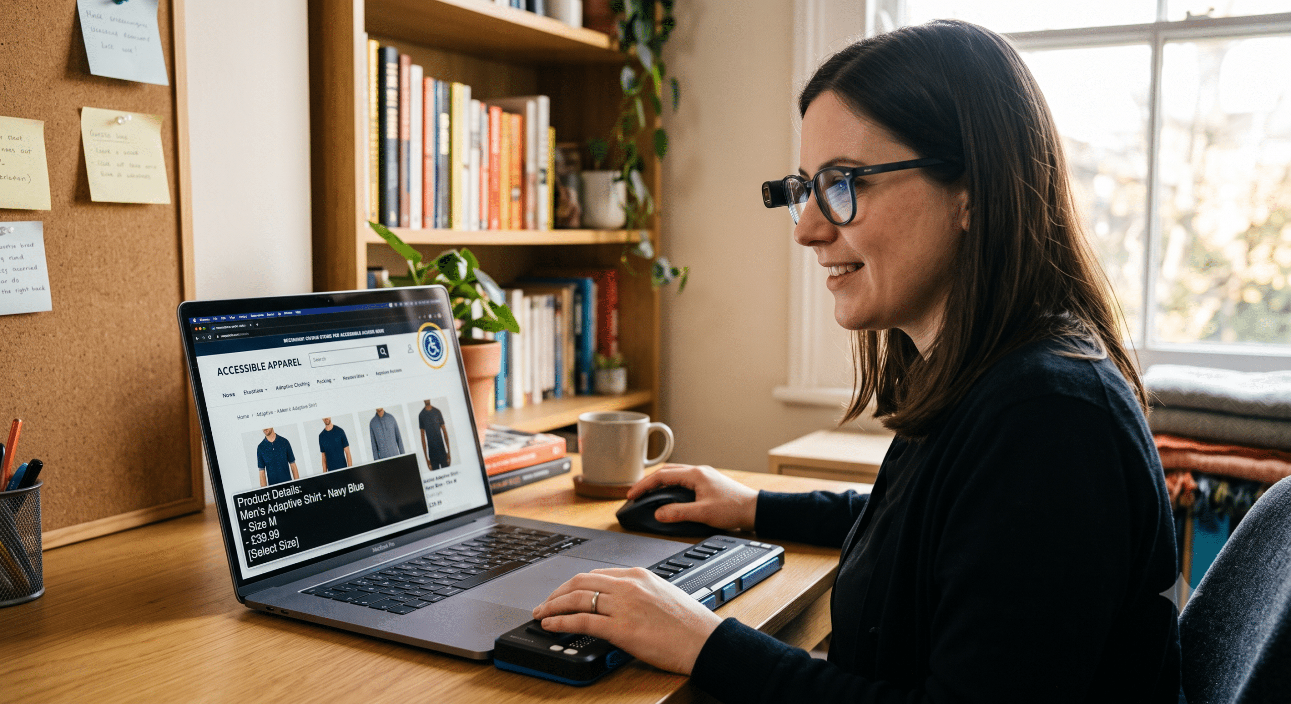
When most business owners think about improving conversions, they usually focus on faster websites, better product pages, or stronger marketing campaigns. Those improvements certainly matter; however, one major opportunity is still overlooked by many ecommerce brands—building an accessible online store.
As a Digital Accessibility Consultant, I’ve seen businesses spend thousands of dollars on advertising while unknowingly losing customers simply because their websites are difficult to use. In particular, visitors may struggle to read product descriptions, navigate with a keyboard, understand checkout forms, or use a screen reader. When that happens, potential customers will simply leave.
Ultimately, accessibility is not only about legal compliance. Instead, it is about creating a seamless shopping experience that every visitor can enjoy. In fact, a store that is easier to use naturally creates more trust, reduces frustration, and consequently increases completed purchases.
Furthermore, research from Baymard Institute shows that accessibility issues remain widespread among major ecommerce websites, especially with images, navigation, forms, and keyboard support. Because of this, those barriers directly affect user experience and, as a result, lower conversion rates.
In this guide, therefore, I’ll explain how creating an accessible online store directly helps improve conversion optimization, customer satisfaction, and long-term business growth.
What Is an Accessible Online Store?
An accessible online store is an ecommerce website designed so people with different abilities can browse products, compare options, add items to their cart, and complete purchases without unnecessary barriers. Specifically, accessibility supports shoppers who may have:
Blindness or low vision: Visitors who rely heavily on screen readers or screen magnifiers.
Color blindness: Shoppers who struggle to distinguish low-contrast elements or color-coded buttons.
Hearing impairments: Customers who need captions or transcripts for product videos.
Limited mobility: Users who rely on keyboards or adaptive devices instead of a mouse.
Cognitive disabilities: Shoppers who require simple layouts and straightforward instructions.
Temporary injuries: Individuals who may temporarily have only one functional hand.
Age-related limitations: Older shoppers experiencing gradual changes in vision or motor control.
In addition, these accessibility standards are largely based on the Web Content Accessibility Guidelines (WCAG), developed by the W3C, which provide practical recommendations for making websites usable for everyone. Above all, almost every accessibility improvement also creates a better overall shopping experience for every customer—not just those with disabilities.
Why Accessibility and Conversion Optimization Go Together
Conversion optimization is simply the practice of removing obstacles that prevent people from completing a purchase. Similarly, accessibility achieves the exact same goal by systematically eliminating technical and usability barriers.
For instance, consider how these principles directly align:
Better navigation: Because site structure is clearer, shoppers find products much faster.
Clear buttons: By using action-focused labels, you directly increase customer clicks.
Larger text: Since legibility is improved, overall readability increases for everyone.
Better forms: Through clear error messaging, checkout mistakes are significantly reduced.
Keyboard support: As a result, navigating without a mouse becomes much easier.
Simple layouts: Because distractions are removed, user confusion is minimized.
Therefore, instead of thinking about accessibility as another burdensome project, you should think of it as conversion optimization designed for every single customer.
12 Ways an Accessible Online Store Improves Ecommerce Conversion
1. Faster Product Discovery
First and foremost, customers should never struggle to find products. To achieve this, good accessibility practices require:
Clear categories: So that shoppers instantly know where to click.
Logical navigation: Because predictable menus reduce browsing friction.
Effective search functionality: Thus helping buyers quickly locate specific items.
Proper page headings: Which allow screen readers and skimmers to scan content easily.
Consistent menus: Therefore preventing users from getting lost across different pages.
As a result, visitors spend significantly less time searching and far more time actually shopping.
2. Better Product Images
Undoubtedly, images sell products. However, many online stores forget that screen readers cannot understand images without descriptive alternative text.
Instead of writing generic filenames like:
"Image1.jpg"
You should instead write descriptive alt text like:
"Black leather backpack with padded laptop compartment and adjustable shoulder straps."
Consequently, meaningful descriptions improve accessibility while simultaneously helping search engines understand your content. In fact, Baymard’s ecommerce accessibility research found image accessibility remains one of the most common problems across online stores today.
3. Easier Reading
In addition, long, dense paragraphs frequently discourage shoppers. To combat this, accessible content deliberately utilizes:
Short sentences: Because they are easier to digest quickly.
Clear headings: Which visually break up dense blocks of text.
Bulleted lists: So that key features stand out immediately.
Simple language: Thus avoiding unnecessary industry jargon.
Generous spacing: Which creates a clean, comfortable reading layout.
Consequently, customers can quickly scan product pages and make buying decisions faster, which directly supports higher conversions.
4. Better Color Contrast
Furthermore, many ecommerce websites rely on light gray text on white backgrounds because it looks sleek and modern. Unfortunately, this design choice makes text extremely difficult for many users to read.
Nevertheless, maintaining proper contrast enhances the visibility of:
Product descriptions: So details are crisp and legible.
Prices: Which ensures cost information is immediately clear.
Call-to-action buttons: Thus making buttons stand out prominently.
Customer reviews: So social proof is easy to read.
Site navigation: Which allows clear paths to every product.
In short, visitors shouldn’t need to zoom in just to understand what they’re buying.
5. Keyboard Navigation
Importantly, not everyone uses a mouse; in fact, some shoppers navigate online stores entirely with a keyboard. Therefore, every important action should work seamlessly using:
Tab key: To move sequentially forward through interactive elements.
Enter key: In order to activate buttons and submit forms.
Arrow keys: To scroll or move within custom menus and dropdowns.
Escape key: So that users can quickly close modal pop-ups or menus.
Specifically, this full keyboard accessibility must apply to:
Main navigation menus
Product filter drawers
Interactive search bars
Shopping cart preview panels
Multi-step checkout forms
Moreover, research from Baymard found that keyboard navigation problems remain surprisingly common among top ecommerce websites.
6. Clear Call-to-Action Buttons
Additionally, buttons should immediately tell shoppers what happens next. For example, avoid generic, vague labels like:
Click Here
Learn More
Continue
Instead, use explicit, action-oriented labels such as:
Add to Cart
Buy Now
View Product Details
Complete Checkout
By doing so, clear action labels improve accessibility for screen readers while simultaneously increasing overall click-through rates.
7. Better Checkout Forms
Without a doubt, checkout is where many potential sales disappear. However, strategic accessibility improvements can effectively prevent cart abandonment. Specifically, focus on:
Visible labels: So fields remain clear even while typing.
Helpful instructions: Which guide users on proper formatting beforehand.
Clear error messages: That explain precisely how to fix mistakes.
Logical tab order: Thus allowing smooth keyboard progression through fields.
Autofill support: So that saved browser data fills forms instantly.
For example, instead of displaying a vague message like:
"Invalid Input"
You should instead show an actionable error message like:
"Please enter a valid email address."
Ultimately, small improvements like these drastically reduce customer frustration right at the point of purchase.
8. Mobile Accessibility
Today, a vast majority of ecommerce visitors shop using smartphones. Consequently, an accessible online store must incorporate:
Large touch targets: So buttons are easy to tap without misclicking.
Responsive layouts: Which fluidly adapt to any screen size.
Readable fonts: That remain legible on smaller mobile displays.
Proper spacing: To prevent accidental links from being triggered.
Smooth scrolling: So that content moves naturally without stuttering.
In this way, accessibility and mobile usability work hand in hand to drive mobile conversions.
9. Screen Reader Compatibility
Furthermore, screen readers allow blind users to browse websites seamlessly. However, proper semantic HTML structure is strictly required so that these tools can correctly interpret:
Page headings and subheadings
Product names and variations
Pricing structures and discounts
Customer star ratings and reviews
Interactive buttons and links
Dynamic shopping cart totals
Overall, semantic HTML provides a much better experience than relying only on visual design overlays.
10. Accessible Product Videos
Likewise, video media should always include accessible alternatives, such as:
Captions: So hearing-impaired users can follow audio.
Transcripts: Which allow quick text reading of video content.
Audio descriptions: To explain visual actions when needed.
Additionally, customers watching videos in noisy environments or without sound also benefit from these features, thus proving that accessibility consistently improves engagement for everyone.
11. Reduced Customer Frustration
In reality, customers rarely file formal complaints when a site fails; instead, they simply leave for a competitor. In effect, accessibility eliminates many of the subtle frustrations that quietly hurt conversions every day, such as:
Tiny, unclickable buttons
Confusing, hidden menus
Missing form field labels
Trapping keyboard focus in pop-ups
Poor visual navigation hierarchies
When the shopping journey feels effortless, consequently, far more visitors will complete their purchases.
12. Stronger Customer Trust
Finally, people naturally buy from brands they trust. Therefore, operating an accessible online store clearly demonstrates that a company cares about every customer.
In turn, that authentic commitment builds:
Long-term brand loyalty: Because shoppers feel valued and respected.
Positive customer reviews: Which attract even more organic buyers.
Repeat purchases: Since the experience was easy and pleasant.
Word-of-mouth referrals: As happy customers recommend your store to others.
Indeed, accessibility isn’t just good technical design—it is exceptional customer service.
Common Accessibility Mistakes Ecommerce Stores Still Make
Despite good intentions, even successful online stores often overlook basic accessibility principles. For instance, some of the most common mistakes include:
Missing alt text on critical product images
Poor color contrast on light text or call-to-action buttons
Interactive buttons without clear, descriptive text labels
Multi-step checkout forms that are difficult to complete
Dropdown menus that do not work with keyboard navigation
Promotional pop-ups that trap keyboard focus indefinitely
Error messages that do not explain how to fix the problem
Inconsistent or skipped heading structures throughout product pages
While many of these issues are relatively simple and inexpensive to fix, resolving them can nevertheless have an outsized positive impact on overall usability and conversions.
How to Build an Accessible Online Store That Converts Better
Fortunately, improving your online store doesn’t mean rebuilding your entire ecommerce website from scratch. Rather, most businesses can make meaningful improvements over time by evaluating the shopping experience through the customer’s eyes.
As a Digital Accessibility Consultant, I usually recommend starting with your core customer journey. Specifically, walk through every step—from landing on the homepage to completing a purchase—and ask one simple question: Can everyone complete this task without frustration?
If the answer is no, you’ve consequently found an immediate opportunity to improve both accessibility and conversion rates.
Follow WCAG Best Practices
The Web Content Accessibility Guidelines (WCAG) serve as the international benchmark for web accessibility. Although the full documentation is extensive, ecommerce stores should focus primarily on four core principles:
1. Make Content Easy to Perceive
First, customers need to easily see, hear, or understand the information on your website. To achieve this, implement:
High color contrast ratios
Readable, flexible font sizes
Descriptive alternative text for images
Synchronized captions for videos
Clean, uncluttered page layouts
Otherwise, if shoppers struggle to perceive your products, they simply won’t buy them.
2. Make Navigation Easy to Operate
Second, visitors should never feel trapped on your website. Accordingly, your store should allow customers to:
Navigate using only a keyboard
Skip repetitive navigation header bars
Open and close menus easily
Access and clear product filters smoothly
Reach final checkout without technical obstacles
As a result, smooth navigation creates lasting confidence throughout the buying journey.
3. Make Information Easy to Understand
Third, many ecommerce websites accidentally confuse shoppers with complex interfaces. To prevent this, use:
Plain, clear language
Simple, step-by-step instructions
Consistent page layouts across all categories
Predictable, intuitive navigation menus
Helpful, polite error messages
Remember, people visit your website to shop—not to solve complicated design puzzles.
4. Make Your Website Compatible
Fourth, an accessible online store must function smoothly across a wide range of setups, including:
Screen readers and assistive software
Mobile devices and tablets
Varying desktop browser engines
Voice control input software
Adaptive hardware controllers
Ultimately, broad technical compatibility ensures that every customer enjoys a similarly high-quality shopping experience.
Accessibility Improves SEO Too
Interestingly, many business owners don’t realize that accessibility and search engine optimization (SEO) strongly support each other. Specifically, search engines prefer websites that are well-organized, clear, and technically sound.
In fact, accessibility improvements directly benefit SEO by providing:
Better heading structures: Which help search engines parse page context.
Descriptive page titles: So that search results display clear topic intent.
Meaningful image alt text: Which allows image indexing in Google Search.
Improved internal linking: Thus spreading page authority cleanly.
Cleaner HTML code: Which accelerates site crawl efficiency.
Faster page loading times: Because clean code renders much faster.
Better mobile usability: Which is a primary Google ranking factor.
Because Google’s guidance on creating helpful, people-first content aligns closely with accessibility practices, both emphasize clarity, usability, and a positive user experience. Consequently, when your website becomes easier for human users to understand, it naturally becomes easier for search engine crawlers to index as well.
Why Accessibility Reduces Cart Abandonment
Cart abandonment remains one of the biggest challenges in ecommerce. While customers sometimes leave because of price, other times they leave simply because the checkout experience feels unnecessarily difficult.
Fortunately, accessibility directly eliminates this friction. For example:
Confusing Forms: Customers shouldn’t have to guess what information belongs in a field. Instead, accessible forms use visible labels, field examples, inline validation, and clear instructions.
Difficult Error Messages: Instead of displaying a generic “Error”, try: “Your ZIP Code must contain five numbers.” By doing so, helpful guidance encourages customers to complete checkout rather than giving up.
Unexpected Pop-Ups: Pop-ups that suddenly appear can interrupt keyboard users and screen readers. Therefore, if your store uses pop-ups, ensure they allow easy closing, maintain proper focus, and avoid covering critical fields.
Small Touch Targets: Since many customers shop on mobile devices, buttons must be large enough for comfortable tapping. On the other hand, small checkout buttons lead to user mistakes and immediate frustration.
Accessibility Builds Customer Loyalty
While traditional conversion optimization usually focuses on acquiring the immediate sale, accessibility in contrast helps secure repeat orders over time.
Above all, customers remember positive, hassle-free shopping experiences. When they know your website is easy to browse, clear to read, and effortless to purchase from, they are far more likely to return. Furthermore, loyal customers regularly recommend accessible brands to family, friends, and colleagues. Thus, accessibility contributes directly to long-term customer retention.
Accessibility Benefits Older Shoppers
It is also worth noting that not every accessibility improvement is designed strictly for people with permanent disabilities. In fact, many older adults regularly experience:
Gradually reduced vision
Mild hearing loss
Decreased hand mobility or precision
Slower text reading speeds
Reduced color perception
Because these shoppers represent a rapidly growing segment of online buyers, making your online store more accessible allows you to seamlessly serve this audience without needing to create a separate shopping experience.
Accessibility Helps Temporary Disabilities Too
Additionally, accessibility supports people facing temporary or situational challenges, such as:
Trying to shop with a broken arm
Dealing with temporary eye strain or dilation
Recovering from surgical procedures
Holding a baby while shopping on a phone
Viewing a mobile screen under bright direct sunlight
Browsing a store in a noisy or distracting environment
In short, good accessibility naturally adapts to real-world situations. After all, your customers don’t always shop under perfect, quiet conditions.
Practical Accessibility Improvements You Can Make Today
Fortunately, many improvements require minimal time or financial investment while yielding immediate positive results. To start, focus on these high-impact updates:
Improve Product Images
Every product image should include descriptive alternative text. However, avoid keyword stuffing; instead, describe what shoppers actually need to know.
Example: “Women’s waterproof hiking boots with ankle support in dark brown.”
Improve Product Pages
To maximize clarity, each product page should consistently feature:
One clear, main heading ($H1$)
A concise, scannable product description
Transparent pricing and discount details
Accessible customer star ratings and reviews
Clear shipping and delivery information
An easy-to-find, high-contrast “Add to Cart” button
In this way, layout consistency helps shoppers evaluate products rapidly.
Improve Navigation
Ask yourself: Can customers reach key product categories within a few clicks? Ultimately, simpler navigation leads directly to higher conversions.
Improve Search
Internal search features should always:
Accept common spelling mistakes automatically
Display highly relevant matching products
Highlight matching query keywords cleanly
Offer intuitive, easy-to-clear filters
Since customers who search often have strong buying intent, helping them find products quickly is crucial.
Improve Checkout
Reduce unnecessary checkout fields. Specifically, ask only for essential payment and shipping information, because overly long forms actively discourage purchases.
Accessibility Testing Tools Worth Using
While automated tools cannot find every accessibility issue, they nevertheless serve as excellent starting points. Popular options include:
WAVE Evaluation Tool: For quick visual feedback on errors.
axe DevTools: To run automated browser audits during development.
Lighthouse: Which checks accessibility alongside speed and SEO.
Accessibility Insights: For guided manual and automated testing.
Siteimprove: To monitor site-wide accessibility health over time.
Although these tools quickly flag issues like missing alt text, low contrast, and unlabelled forms, automated testing should always be combined with manual review.
Don’t Forget Manual Testing
Because technology alone cannot fully measure human user experience, I strongly recommend manually testing every ecommerce website using these four simple steps:
Keyboard Test: Disconnect your mouse entirely. Then, attempt to browse categories, open menus, select filters, add products, and complete checkout using only your keyboard. If you encounter obstacles, immediate adjustments are needed.
Zoom Test: Increase your browser zoom to 200%. Next, verify whether visitors can still read content, view buttons, and complete forms without breaking the page layout. Indeed, responsive accessibility is essential.
Screen Reader Test: Enable popular screen readers like NVDA, JAWS, or VoiceOver. Then, listen carefully: Does the page structure make logical sense? Can product information be understood without visual context?
Mobile Test: Evaluate your store across several real mobile devices to verify font sizes, button spacing, menu navigation, and search usability. Above all, accessibility must remain consistent across every screen size.
Accessibility Is an Ongoing Process
One of the biggest misconceptions is that web accessibility is a one-time project. In reality, every time you introduce new products, promotional banners, landing pages, blog posts, videos, or checkout features, you must verify that the new content remains fully accessible.
Therefore, treat accessibility as a routine part of your regular website maintenance, right alongside security updates, SEO audits, and performance optimization. As a result, businesses that embed accessibility into their ongoing workflow are far less likely to introduce new barriers over time.
Conclusion
Building an accessible online store is one of the smartest investments an ecommerce business can make. While many companies focus heavily on attracting more traffic through advertising and SEO, they often overlook the shopping experience itself. Yet, if customers struggle to browse products, understand information, or complete checkout, increased traffic alone will not lead to higher sales.
Fortunately, accessibility removes those friction points. As a result, it creates a shopping experience that is easier to use for everyone—including people with disabilities, older adults, mobile shoppers, and customers facing temporary challenges. At the same time, it directly supports conversion optimization goals through better usability, greater trust, lower cart abandonment, and higher overall satisfaction.
From my experience as a Digital Accessibility Consultant, the most successful ecommerce brands treat accessibility as an ongoing business strategy rather than a one-time compliance task. Ultimately, an accessible online store is far more than a legal or technical requirement—it is a distinct competitive advantage. When every visitor can shop with confidence, your business earns stronger customer loyalty, a better brand reputation, and far more consistent revenue over time.
Frequently Asked Questions (FAQ)
What is an accessible online store?
An accessible online store is an ecommerce website designed so people of all abilities can browse products, understand information, and complete purchases without unnecessary barriers. Specifically, it follows accessibility best practices, including full keyboard navigation, readable content, proper color contrast, descriptive image alt text, and seamless compatibility with assistive technologies.
Why is an accessible online store important?
Accessibility improves the shopping experience for everyone, not just people with disabilities. Specifically, it helps customers find products more easily, reduces friction during checkout, increases brand trust, and consequently leads to higher conversion rates.
Does accessibility improve ecommerce conversions?
Yes, absolutely. Accessibility directly removes obstacles that prevent customers from completing purchases. Because clear navigation, readable text, accessible forms, and easy checkout experiences streamline the user journey, they contribute directly to higher conversion rates and lower cart abandonment.
Is accessibility good for SEO?
Yes, indeed. Many accessibility improvements also directly benefit search engine optimization. For instance, key overlapping benefits include:
Descriptive image alt text for image indexing
Logical heading structures for content hierarchy
Better internal linking structures
Mobile-friendly, responsive layouts
Faster page load times and cleaner code
Clear semantic HTML markups
As a result, these updates help both search engines and human users understand your website much more effectively.
What accessibility standard should ecommerce websites follow?
Most businesses aim to meet the Web Content Accessibility Guidelines (WCAG) 2.2 Level AA, which is widely recognized as the recommended global benchmark for accessible web design.
Can small online stores become accessible?
Yes, certainly. Accessibility is by no means limited to large corporations. In fact, small businesses can make immediate, meaningful improvements by:
Writing descriptive alt text for product images
Ensuring high contrast between text and backgrounds
Simplifying main navigation structures
Adding visible labels to form fields
Verifying keyboard-only navigation
In short, even minor updates can significantly improve overall usability and customer satisfaction.
How often should an ecommerce website be tested?
Accessibility testing should be integrated directly into your regular maintenance routine. Specifically, review your store whenever you add new products, launch marketing landing pages, update your theme, install new plugins, or alter the checkout flow.
Can automated accessibility tools find every problem?
No, they cannot. Automated tools are valuable for quickly identifying common technical issues; however, they cannot evaluate real human context or usability. Therefore, manual testing with keyboards, screen readers, and real users remains essential.
What are the biggest accessibility mistakes online stores make?
Common mistakes include missing alt text on images, low color contrast, unlabeled form fields, confusing keyboard navigation, inaccessible pop-ups, tiny touch targets on mobile screens, and vague error messages during checkout.
Is accessibility required by law?
Accessibility requirements vary by country and region. However, in many jurisdictions, ecommerce businesses are legally expected to provide equal access to digital services. Even when specific laws do not apply, following recognized standards remains best practice for reducing legal risk and delivering a superior customer experience.
References
The following high-authority resources provide guidance on ecommerce accessibility, usability, conversion optimization, and inclusive design:
World Wide Web Consortium (W3C): Web Content Accessibility Guidelines (WCAG) 2.2. https://www.w3.org/TR/WCAG22/
WebAIM: Articles and Resources on Web Accessibility. https://webaim.org/
Baymard Institute: Ecommerce UX Research and Accessibility Benchmark. https://baymard.com/blog/accessibility-benchmark-launch
Nielsen Norman Group: Accessibility and User Experience Research. https://www.nngroup.com/
Deque Systems: Digital Accessibility Learning Center. https://www.deque.com/
U.S. Department of Justice: Accessibility Guidance for State and Local Government Websites. https://www.ada.gov/resources/web-guidance/
The A11Y Project: Web Accessibility Checklist. https://www.a11yproject.com/
MDN Web Docs: Accessibility Documentation. https://developer.mozilla.org/en-US/docs/Web/Accessibility
Google Search Central: Creating Helpful, People-First Content. https://developers.google.com/search/docs/fundamentals/creating-helpful-content
Microsoft Accessibility: Inclusive Design and Accessibility Resources. https://www.microsoft.com/accessibility
Adobe Accessibility: Accessibility Resources and Best Practices. https://www.adobe.com/accessibility.html