

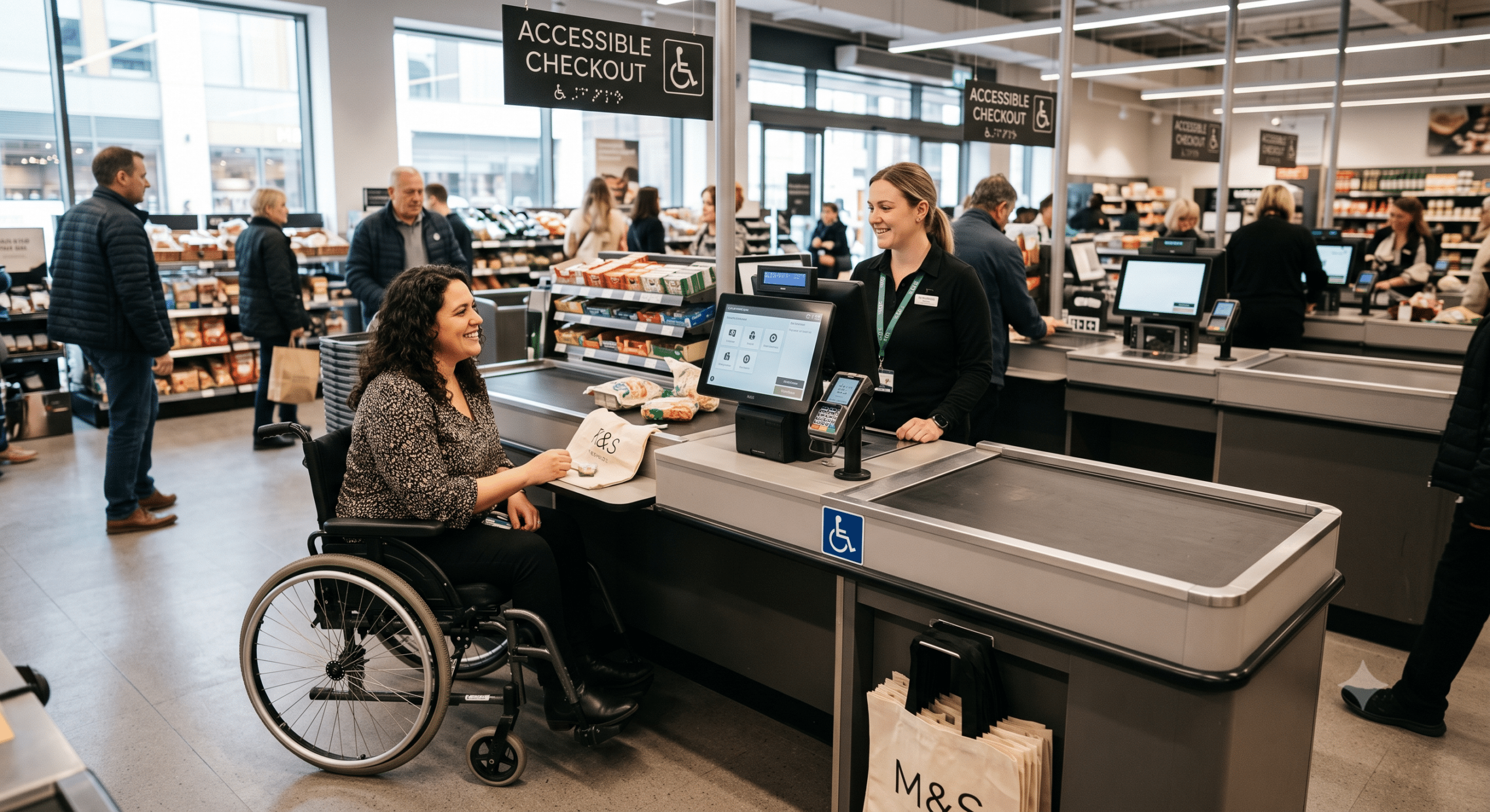
Mastering accessible checkout design is the most effective way for ecommerce stores to reduce cart abandonment and drive completed purchases. While companies spend thousands of dollars improving product pages, running ads, and testing different layouts, many overlook the most critical point of the customer journey: the checkout process.
As a Digital Accessibility Consultant, I’ve reviewed hundreds of ecommerce websites. In doing so, one pattern appears over and over again. Customers don’t leave simply because they changed their minds; rather, they leave because the checkout process becomes frustrating, confusing, or impossible to complete. This is precisely where accessible checkout design makes a measurable difference.
Accessibility is often discussed as a legal requirement or a way to support people with disabilities. While both points are undoubtedly true, accessibility also plays a direct role in conversion optimization. Consequently, a checkout that is easier to understand, navigate, and complete helps every shopper—not just those using assistive technology.
Think about the last time you bought something online. For instance, maybe you were using your phone while waiting in line. Perhaps your internet connection slowed down, or maybe you mistyped your address and couldn’t find the right payment button.
Those small moments create friction. Fortunately, accessibility removes that friction.
An accessible checkout gives customers confidence. Specifically, it reduces errors, speeds up purchases, and builds trust with your brand. As a result, these improvements frequently lead to lower cart abandonment and higher conversion rates.
Why Checkout Accessibility Matters More Than Ever
The average ecommerce store loses a significant number of customers during checkout. Indeed, research from the Baymard Institute continues to show that complicated checkout experiences remain one of the primary reasons shoppers abandon their carts. Importantly, many of these problems have nothing to do with pricing.
Instead, customers encounter friction through barriers such as:
Confusing forms
Tiny buttons
Poor color contrast
Unclear error messages
Keyboard navigation failures
Payment fields that don’t work correctly
Unexpected validation errors
These problems affect everyone. Now, imagine navigating these same barriers as someone who:
Has limited vision
Cannot use a mouse
Relies on voice control
Has dyslexia
Experiences cognitive fatigue
Uses a screen reader
Without an accessible checkout design, completing a purchase can become nearly impossible. However, good accessibility removes these unnecessary obstacles so that every customer has an equal opportunity to complete a transaction.
Accessibility and Conversion Optimization Go Together
Many business owners separate accessibility from marketing; however, that is a mistake. In fact, both disciplines share the exact same objective: helping more visitors become customers. When people can easily complete tasks, they naturally buy more often.
Accessibility improves nearly every core conversion metric, including:
Checkout completion rate
Customer satisfaction
Repeat purchases
Mobile usability
Trust in the brand
Reduced support requests
Furthermore, a smooth checkout lowers frustration, which subsequently encourages shoppers to finish purchases instead of abandoning them. From a business perspective, therefore, accessibility is one of the highest-return investments an ecommerce company can make.
What Is Accessible Checkout Design?
Accessible checkout design means creating a purchasing experience that everyone can use, regardless of ability, device, or browsing method. To achieve this, it follows accessibility standards like the Web Content Accessibility Guidelines (WCAG) while focusing heavily on general usability.
Specifically, an accessible checkout allows customers to:
Understand every step clearly
Navigate without confusion
Complete forms effortlessly
Recover easily from mistakes
Use assistive technologies without friction
Purchase products independently
Ultimately, accessibility isn’t about making a “special” checkout—rather, it’s about making one unified checkout that works for everyone.
The Business Benefits of Accessible Checkout Design
Many executives ask me the same question: “Will accessibility actually improve sales?”
The answer is yes—provided it is implemented correctly. Because accessibility removes the friction that prevents customers from finishing transactions, it delivers several measurable business benefits:
Higher Conversion Rates
Customers abandon fewer carts when the checkout process is simple and predictable. Since every unnecessary obstacle creates another opportunity for shoppers to leave, reducing friction naturally increases completed orders.
Lower Cart Abandonment
Long forms and confusing instructions are among the leading causes of cart abandonment. In response, accessibility encourages:
Shorter, streamlined forms
Clearer instructions
Logical navigation sequences
Better real-time feedback
Consequently, each improvement helps customers keep moving smoothly toward the final purchase.
Better Mobile Shopping
Because more than half of online purchases now happen on mobile devices, small screens make accessibility even more critical. For example, larger touch targets, readable text, and simple layouts directly improve mobile conversions for every shopper.
Improved Customer Trust
People notice when a website feels professional. As a result, customers place more trust in stores that are easy to navigate, consistent, predictable, and responsive. Ultimately, an accessible checkout sends a clear message that the business cares about every customer—and trust directly influences purchasing decisions.
Common Accessibility Mistakes That Hurt Sales
Many ecommerce platforms offer attractive checkout templates. However, attractive does not always mean usable. Here are several frequent problems I discover during accessibility audits:
Tiny Form Fields: Small input boxes make typing difficult, especially on smartphones, causing customers to tap the wrong field and become frustrated correcting mistakes. Larger input areas improve accuracy significantly.
Poor Color Contrast: Although light gray text on white backgrounds may look modern, many shoppers struggle to read it—particularly older adults, users in bright sunlight, or people with low vision. Readable text keeps users moving confidently through checkout.
Error Messages That Don’t Help: Imagine entering payment details only to see “Invalid input.” Instead of leaving users guessing what went wrong, accessible checkout design provides clear instructions explaining exactly what needs attention.
Hidden Required Fields: Indicating required fields with only a red outline creates major barriers for color-blind users and screen readers. Therefore, required fields should always be clearly labeled with explicit text.
Keyboard Navigation Problems: Since many people rely on keyboards, switch devices, or voice commands rather than a mouse, blocked keyboard navigation stops sales in their tracks.
15 Accessible Checkout Design Best Practices
1. Keep Checkout Steps Simple
Customers should always know where they are in the purchasing process. Therefore, display a simple progress indicator (e.g., Cart $\rightarrow$ Shipping $\rightarrow$ Payment $\rightarrow$ Review $\rightarrow$ Complete). As a rule, predictability reduces anxiety.
2. Label Every Form Field Clearly
Never rely on placeholder text alone, because placeholders disappear once typing begins. Instead, keep labels visible at all times to assist screen reader users and shoppers with memory or cognitive challenges.
3. Support Keyboard Navigation
Ensure every interactive element is accessible using standard navigation keys (Tab, Shift + Tab, Enter, Spacebar). Furthermore, users should never become trapped inside a form field or pop-up.
4. Write Helpful Error Messages
Instead of stating a generic “Error,” use specific language such as “Please enter a valid ZIP code.” This way, helpful messages reduce frustration and allow customers to recover quickly.
5. Make Buttons Easy to Find
Primary action buttons should stand out distinctly without relying solely on color (e.g., “Continue to Shipping,” “Review Order,” or “Complete Purchase”). In addition, make buttons large enough to tap comfortably on mobile devices.
6. Use High-Contrast Colors Throughout Checkout
Color plays an important role in usability, yet it should never be the only way information is communicated. Strong color contrast should be used across all labels, buttons, links, form fields, and confirmations. As a result, customers can read instructions easily under any lighting conditions.
7. Design Larger Touch Targets
Today’s online shoppers increasingly complete purchases on mobile devices. Small buttons or closely spaced links often lead to accidental taps—such as accidentally tapping “Return to Cart” instead of “Pay Now.” To prevent this, implement larger buttons, adequate spacing, and easy-to-select checkboxes and radio buttons.
8. Allow Customers to Review Their Information
Give shoppers a final screen to verify their shipping address, billing info, payment method, promo codes, and order summary. This simple step reduces costly ordering mistakes while lowering overall customer anxiety.
9. Don’t Force Account Creation
Forcing registration creates immediate friction for shoppers who simply want to buy a single product. Instead, offer guest checkout, social sign-in, or optional account creation after purchase. Consequently, shoppers can complete their purchase without delay.
10. Keep Instructions Short and Clear
Accessibility often means reducing complexity. For instance, instead of saying “Authentication failed because credential verification could not be completed,” simply state “Your password doesn’t match our records.” Clear communication speeds up the entire checkout process.
11. Make Payment Options Accessible
Different customers prefer different payment methods (e.g., credit cards, digital wallets, PayPal, or Apple Pay). To support this, ensure every payment button includes descriptive labels, keyboard support, screen reader compatibility, and clear visual focus indicators.
12. Preserve User Information During Errors
Nothing frustrates shoppers more than completing a long form only to discover everything cleared due to one mistake. Therefore, always preserve previously entered data when validation fails so customers only correct the specific field containing the error.
13. Support Screen Readers Properly
Many checkout pages still include unlabeled buttons or missing form labels. By using proper heading hierarchies, descriptive labels, accessible form controls, and meaningful button names, screen readers can guide visually impaired shoppers naturally from one step to the next.
14. Avoid Unexpected Changes
Predictability is fundamental to accessible design. Consequently, customers should never be surprised by unexpected interface changes, such as automatically jumping to another page, auto-refreshing forms, or unprompted pop-up windows. Every action should occur because the user intentionally initiated it.
15. Test with Real Users
While automated accessibility tools are valuable, they cannot identify every usability flaw. Therefore, regularly conduct testing sessions with real, diverse participants—including screen reader users, keyboard-only users, older adults, and individuals with cognitive disabilities.
Accessibility Improves SEO and Platform Success
Many ecommerce owners don’t realize that accessibility also supports search engine optimization (SEO). Although accessibility itself is not a direct ranking factor, search engines like Google reward websites that deliver superior user experiences.
For example, structured heading hierarchies help both screen readers and search engines parse content efficiently. Similarly, cleaner layouts reduce user confusion, which in turn keeps engagement signals strong. In addition, accessible image descriptions (alt text) assist screen readers while helping product images rank in search engine results.
Platform-Specific Guidance
Shopify: While Shopify provides a strong core foundation, third-party themes and installed apps often introduce hidden contrast or keyboard navigation issues. Therefore, audit app integrations carefully.
WooCommerce: Because plugins originate from various developers, user experiences can become inconsistent. As a result, regular accessibility audits are essential to identify missing labels or broken keyboard paths.
Magento (Adobe Commerce): Given its highly customized, enterprise-level nature, stores running Magento should incorporate accessibility reviews throughout the development process rather than waiting until launch.
Accessibility Is an Ongoing Process
One of the biggest misconceptions is that accessibility is a one-time project; however, ecommerce stores are constantly evolving. As new products, promotions, payment gateways, and plugins are added, new accessibility barriers can emerge.
To maintain compliance and performance, successful businesses establish continuous QA processes, including:
Quarterly accessibility audits
Manual usability testing
Automated scanning
Regular content and theme reviews
Employee and developer training
Measuring the Success of an Accessible Checkout
Improving accessibility should always yield measurable business results. To track performance, monitor key metrics before and after implementing changes, such as:
Checkout completion rate
Cart abandonment rate
Mobile conversion rate
Average order value
Customer satisfaction scores and support request volume
Time required to complete checkout
By tracking these metrics, businesses can clearly demonstrate their return on investment while identifying areas for ongoing refinement.
Conclusion
Creating an accessible checkout design is one of the smartest investments an ecommerce business can make. While many companies focus heavily on attracting new visitors through advertising and SEO, they often overlook the final step that actually generates revenue—the checkout experience.
As a Digital Accessibility Consultant, I’ve seen firsthand how small accessibility improvements produce meaningful business results. Ultimately, accessibility is about more than meeting technical standards; it is about creating an online store where every customer feels confident, respected, and capable of buying without friction.
When you prioritize inclusive design, higher conversion rates, lower cart abandonment, and stronger customer loyalty naturally follow. Therefore, whether you build on Shopify, WooCommerce, Magento, or a custom solution, make accessibility a standard part of every update. By doing so, you make buying simple for every customer.
Frequently Asked Questions (FAQ)
What is accessible checkout design?
Accessible checkout design is the practice of creating an ecommerce checkout process that everyone can use, including people with disabilities. Specifically, it follows established accessibility standards such as WCAG while simultaneously improving overall user experience and usability for all shoppers.
Why is accessible checkout design important?
An accessible checkout reduces barriers that prevent shoppers from completing transactions. Consequently, it enhances user satisfaction, lowers cart abandonment rates, increases conversions, and helps businesses comply with digital accessibility regulations. (W3C)
Does accessibility improve ecommerce conversion rates?
Yes. Removing unnecessary friction during checkout allows more shoppers to complete their purchases smoothly. In fact, research consistently shows that optimizing checkout usability directly expands conversion opportunities while reducing abandonment rates. (Baymard Institute)
What accessibility issues are most common during checkout?
Some of the most frequently encountered barriers include:
Missing or hidden form labels
Insufficient color contrast
Broken keyboard navigation
Vague or unhelpful error messages
Undersized touch targets on mobile
Mandatory account registration
Inaccessible payment forms and missing focus indicators
Is WCAG required for ecommerce websites?
Many organizations worldwide adopt the Web Content Accessibility Guidelines (WCAG) as the standard benchmark for accessible digital experiences. Depending on your operational jurisdiction or industry regulations, compliance with WCAG may be legally referenced or mandated. (W3C)
How often should an ecommerce checkout be tested?
Accessibility testing should be performed regularly—especially following theme updates, plugin installations, checkout redesigns, or payment gateway modifications. As a general rule, quarterly accessibility reviews provide a solid baseline for most ecommerce brands.
Can accessibility improve mobile checkout performance?
Absolutely. Because features like larger tap targets, readable text sizes, generous spacing, and simplified input forms streamline mobile interaction, accessibility updates directly drive higher mobile conversion rates.
What tools can help evaluate checkout accessibility?
Several tools exist to audit accessibility, including automated scanners and browser extensions. However, automated tools only catch a portion of potential barriers; therefore, the most effective strategy combines automated testing with manual reviews conducted by accessibility specialists and real users relying on assistive technologies. (arXiv)
Key Takeaways
Removes Barriers: Accessible checkout design eliminates friction, allowing every customer to complete transactions seamlessly.
Universal Usability: Accessibility improvements benefit all shoppers, not just individuals using assistive technology.
Drives Revenue: Smoother checkout experiences directly lead to higher conversion rates and lower cart abandonment.
WCAG Compliance: Adopting WCAG guidelines establishes a robust legal and functional foundation for inclusive commerce.
Continuous Strategy: Accessibility must be integrated into every software update, design iteration, and plugin deployment.
Real-User Testing: Combining automated scans with real-user usability testing delivers the best long-term outcomes.
References
Baymard Institute. Cart & Checkout UX Usability Research & Findings. Comprehensive benchmark studies analyzing e-commerce checkout friction, usability standards, and cart abandonment drivers. Available at: Baymard Cart & Checkout Research
WooCommerce Blog. Web Accessibility in Ecommerce: Complete Guide & Checklist. Practical guide on building inclusive e-commerce stores, WCAG implementation, and accessibility-driven conversion optimization. Available at: WooCommerce Accessibility Guide
World Wide Web Consortium (W3C). Web Content Accessibility Guidelines (WCAG) 2.1 & 3.0 Technical Standards. Official international web accessibility standards for forms, focus states, and assistive technologies. Available at: W3C WCAG Standards
DeveloperUX. Checklist for Accessible E-Commerce Checkout Design. In-depth tactical guide focusing on keyboard navigation, custom form field labels, payment gateway focus states, and dynamic error management in checkouts. Available at: DeveloperUX Checkout Checklist
AudioEye Blog. Guide to eCommerce Accessibility and Why It’s Good for Business. Insights into the POUR accessibility principles (Perceivable, Operable, Understandable, Robust) and their direct impact on reducing cart abandonment rates. Available at: AudioEye eCommerce Accessibility Guide
Equally AI Blog. E-Commerce Accessibility: Optimizing Shopping Carts, Checkout Pages, and Payment Gateways. Detailed breakdown on optimizing checkout flow, screen-reader compatibility, and third-party payment integration accessibility. Available at: Equally.AI Checkout Accessibility Optimization